Mission Bay Shuttle Redesign

The Mission Bay Shuttle (MBS) is a free community shuttle providing first and last mile connection between the Mission Bay neighborhood and major transit hubs, such as BART stations, Caltrain, and the Salesforce Transit Center. Though the shuttle provides an essential service for the community, the rider experience can be confusing and disjointed. Together with my partner, Shola Fashola, I set out to redesign the shuttle experience to maximize clarity and rider confidence.

Process

Research and Ideation

During the first three weeks of the project, we focused on answering the following questions:
  • Who are the MBS users?
  • What do they want from the MBS experience?
  • What would bring them satisfaction and enjoyment?
  • What is working well? What isn’t working?
  • How might we improve the MBS experience for riders?
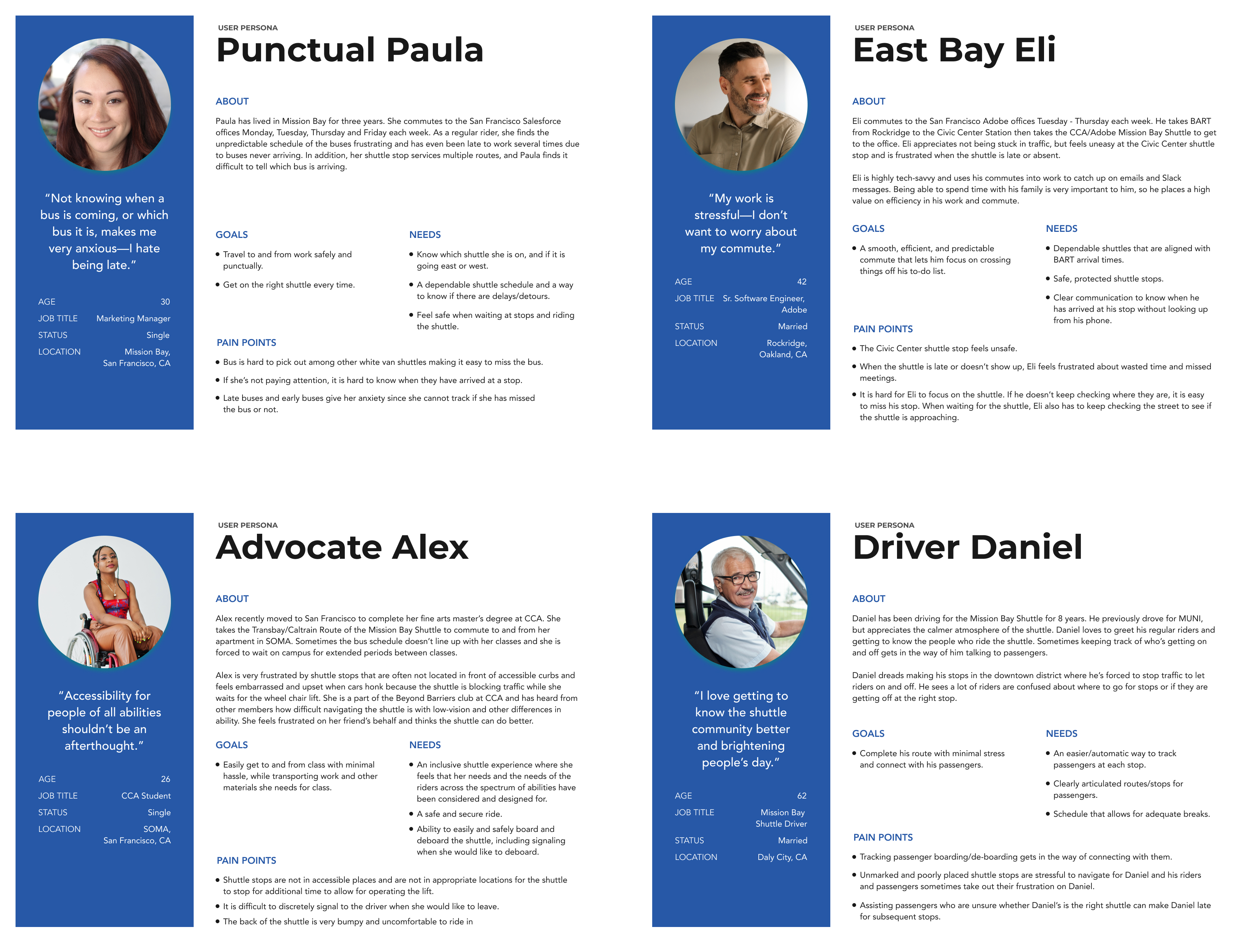
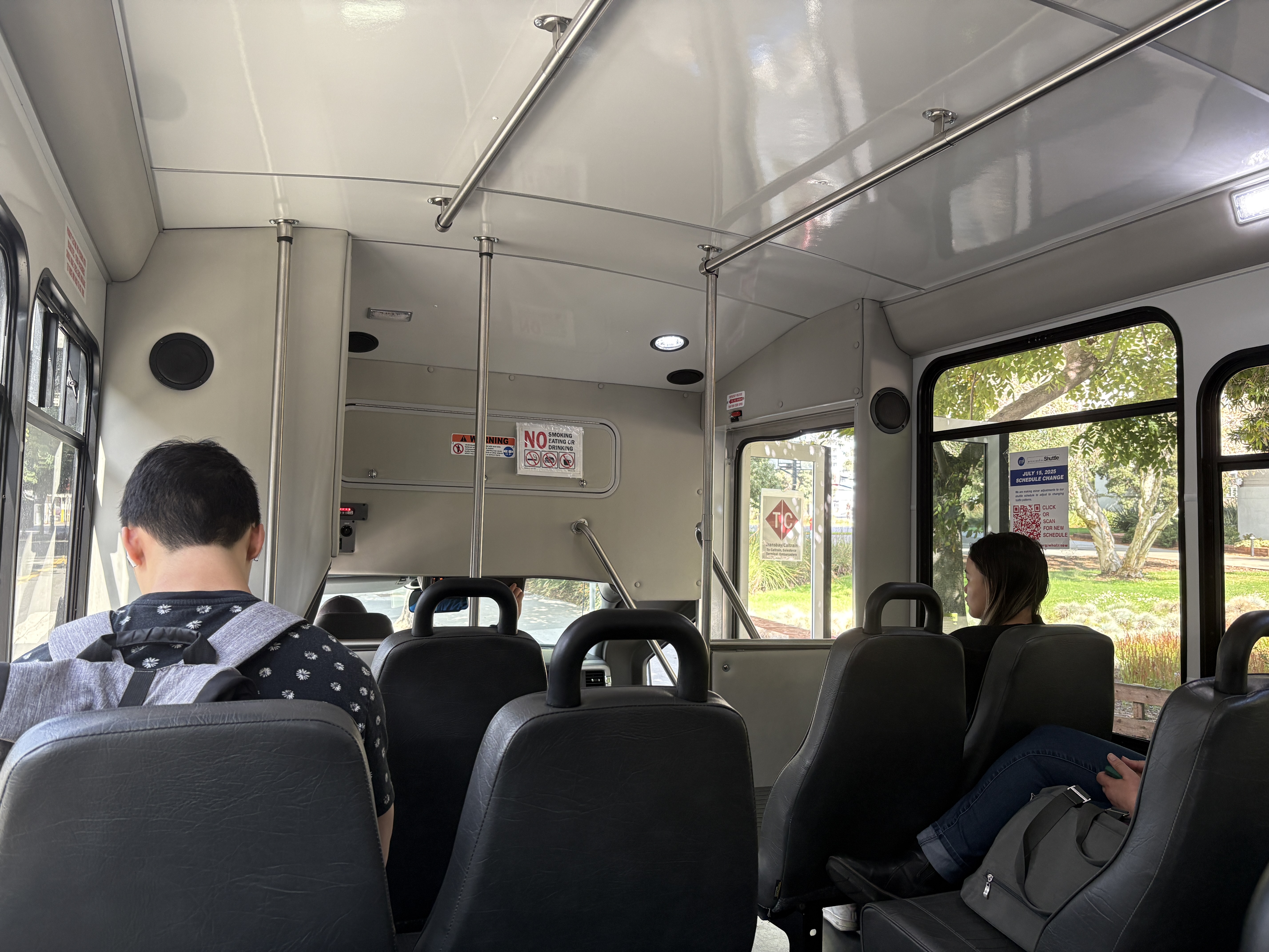
We conducted primary and secondary research—riding the shuttle to observe passengers and the shuttle ecosystem as well as reading the shuttle’s annual report and other case studies of successful transit systems. We translated our research into a set of four personas and constructed mood boards to illustrate our vision for the new experience. We then utilized prototype mapping and user flow diagramming to arrive at our preliminary set of solutions and wrote our design brief.
Observational Research
Secondary Research
Mood Board
Personas
Prototype Mapping
User Flows

Core Problems

From this phase of the project, we determined the core problems with the shuttle were:

Constraints

As a privately sponsored shuttle, the Mission Bay Shuttle is not allowed to display signage on San Francisco streets. Additionally, shuttle stops can not be moved from their existing locations. Expenses must be kept affordable, and the existing fleet of shuttles must remain.

Initial Proposed Solutions

Onboard Shuttle Screens
Onboard shuttle screens would allow passengers to track their ride in real time without having to download an app, own a smartphone, or change tabs on their device. This way riders can easily check they are on the correct shuttle, be alerted to approaching stops, view important shuttle protocol announcements, and see if they are on a detour, projected arrival times for upcoming stops, and transfer points for connecting transit. Digital displays enable content to be shown in multiple languages to better accommodate San Francisco’s diverse population. Together, this would increase passenger’s sense of confidence and assurance during their trip and could foster more positive driver/rider interactions by reducing riders’ confusion and stress.
App
An MBS app could provide additional shuttle information (such as routes, delays, schedule, arrivals, and detours) as well as wayfinding assistance through AR technology to make finding shuttle stops easier. An app could also provide alerts (including haptic feedback) for approaching shuttles/stops. Riders who need accommodations could use the app to signal these needs to the shuttle driver, including use of the wheelchair ramp.
Utilize Onboard PA System
The Mission Bay Shuttles come equipped with a PA system that is not currently in use. Announcing upcoming and current stops in multiple languages would provide clarity for riders—especially those with limited vision or who are focused on their devices.
Shuttle Exterior Differentiation
Redesigning the exterior of the Mission Bay Shuttles would enable them to be more distinct from the many other local shuttles that run in the area and easier to spot from a distance. Adding the shuttle route prominently to the exterior would also help riders determine the correct shuttle to board.
Shuttle Onboard Signage
More prominent onboard signage could help clarify shuttle protocols for riders. In the event the onboard screens are out of order, onboard signage could serve as a back up. Additionally, signage could be used to designate a priority seating section for passengers at the front of the bus—making boarding/desembarking easier and ensuring these passengers have access to the less bumpy seats at the front of the bus.
Enhance Shuttle Information in Third-Party Mapping Apps
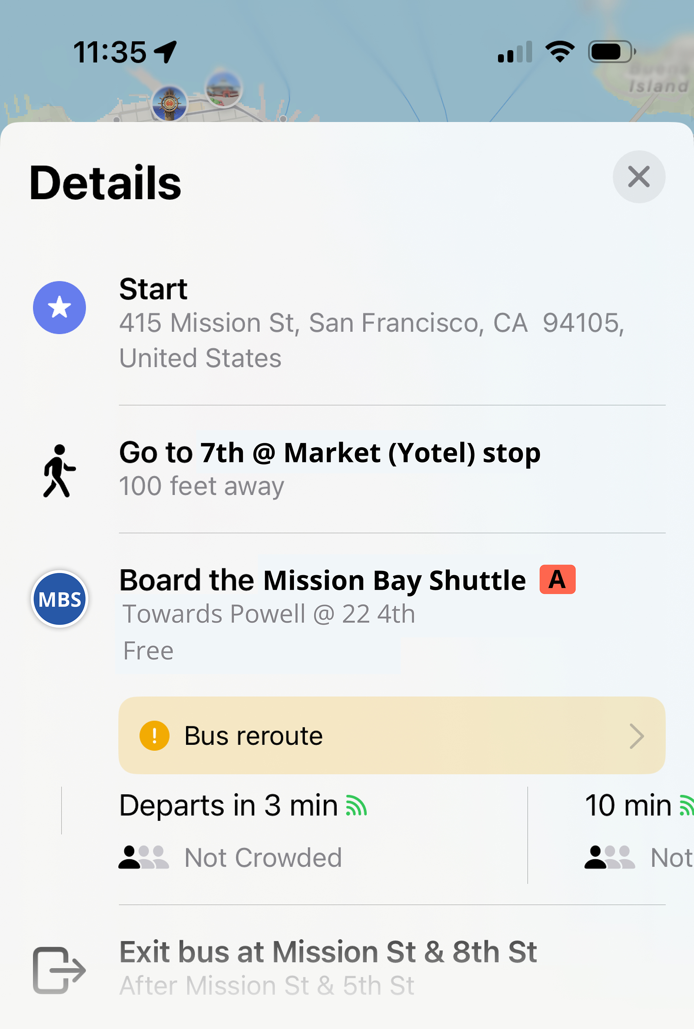
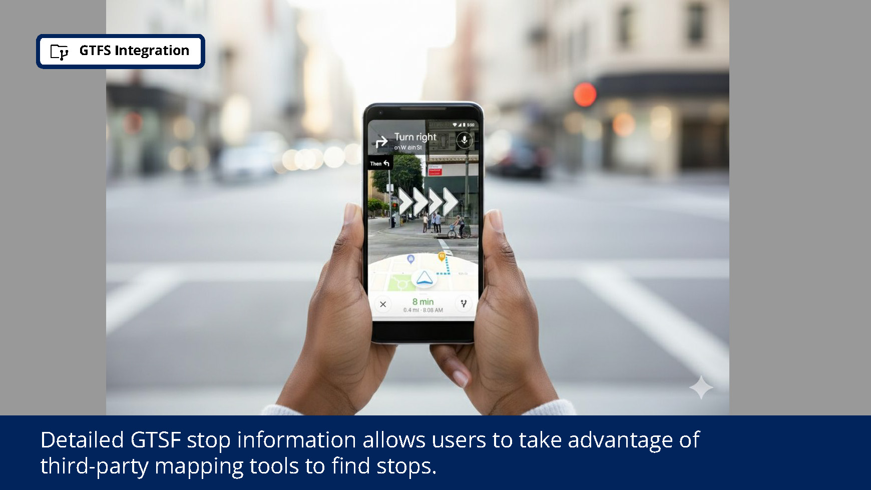
Provide more detailed information to third-party mapping apps through General Transit Feed Specification (GTFS). This allows passengers to better leverage the navigation apps they already use with enhanced information such as a stop description, exact stop locations, images of stops, a live shuttle ETA and current capacity, detour notices, and more.

Exploration and Iteration

After identifying our initial proposed solutions, we created storyboards, concept sketches, and low-fidelity wireframes to explore these ideas more deeply—particularly how they relate to the different dimensions of interaction design (words, visuals, physical objects/space, time, and behavior).
Storyboard
Concept Sketches

Prioritize and Pivot

With two weeks remaining in our project, we needed to prioritize our ideas and decide which we would pursue for our MVP mid-fidelity prototype. We used a red route matrix to determine which of our concepts would deliver the most impact (determined by frequency of use and number of potential users).

We were surprised to discover that, while the app could deliver many valuable features to customers, it was not the most critical of our solutions and much of the app’s functionality could be replicated through our other concepts. This discovery led us to decide to defer the creation of the app to a future phase of the project and prioritize the exterior shuttle demarcation, interior signage and screens, and increased third-party app information.
Red Route Exercise
To illustrate this iteration, I created a new concept sketch.
Updated Concept Sketch

Testing and Iteration

With our refined sketches in hand, we sought out six participants to test our concepts with. We spent approximately 15 minutes with each participant, briefly explaining our concept and discussing their reactions, expectations, and recent experience with local public transit. Utilizing Claude AI to quickly extract insights from the transcripts of these interviews, we found:
This research affirmed the pain points we had observed in our earlier research and the value of our proposed concepts. Based on participant feedback, we also decided to emphasize next stop displays on our screens over live route tracking and to increase the prominence of the “free” message on the shuttle’s exterior.

Final Solutions

After testing our concepts, we arrived at the following list of solutions to pursue for our MVP as we moved into mid-fidelity prototyping:
Real-Time Onboard Display
Install interior screens displaying live shuttle progress, stop announcements, and messages about items such as detours or shuttle procedures.
Visual Branding and Clarity
Redesign shuttle exteriors to make them more distinct from other local shuttles and add route labels for immediate identification.
Priority Seating
Clearly designate the first row of seats with priority seating signs.
Enhanced GTFS
Improve third-party mapping services by providing comprehensive General Transit Feed Specification (GTFS) data.
PA Announcements
Audio announcements for upcoming stops are important for low vision passengers as well as those who are looking at their phones during the journey.

Branding

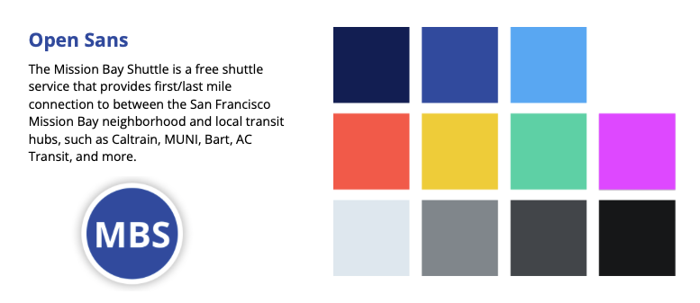
To refresh the shuttle’s branding, we decided to keep the MBS existing typography, but update the logo to be more legible. I selected a new palette, expanding upon the MBS’s mid and light blue colors and adding a bright orange, yellow, teal, and magenta to signify each of the shuttle routes. I tested these colors to ensure a minimum contrast of WCAG AA, with the majority meeting WCAG AAA.
During our research, one participant in particular mentioned that the current shuttle naming conventions (based in part on cardinal directions) was very confusing. As we were starting to consider how to display the route and “Mission Bay Shuttle” name on the headers of the shuttle, we concluded that simplifying the naming convention, and relabeling the routes A, B, C, and D would be best.

Shuttle Exterior

I redesigned the exterior of the shuttles to make them much more visible and distinctive (both during the day and at night). Route labels on the header and doors of the shuttles allow passengers to confirm they are boarding the correct shuttle. The large “Mission Bay Shuttle” on each side enhances shuttle recognition for riders and promotes discoverability of the shuttle for potential new riders, while the enlarged “Free to all” label makes it clear that fare is not required. Additionally, wheelchair icons on the back doors of the shuttle indicate that this is where the wheelchair lift is located.
Shuttle mock ups created using Google Gemini and Photoshop.

Priority Seating

By adding priority seating signage to the front row of the shuttle, we can make boarding/desembarking easier and ensuring these passengers have access to the less bumpy seats at the front of the shuttles.
Shuttle mock ups created using Google Gemini and Photoshop.

Onboard Screens

To allow for visibility throughout the shuttle, we determined five screens should be added to the shuttle’s interior—a 37” ultra-wide display at the front, two 24” displays in the middle, and two 13” tablets mounted to the last row of seats. On the Mission Bay Shuttles, wheelchair seating is located at the rear, and mounting these screens onto the chairs helps ensure they will be at an appropriate height for wheelchair users.
Shuttle mock ups created using Google Gemini and Photoshop.
In designing the screens, I used large font to promote legibility at a distance and kept content streamlined to maximize clarity for the elements our test participants cited as most important (the names and projected ETAs for the next few stops) and minimize cognitive strain. I designed the screens to cycle through four languages (English, Spanish, Chinese, and Tagalog—the languages required to comply with the San Francisco Language Access Ordinance).
PA Announcements

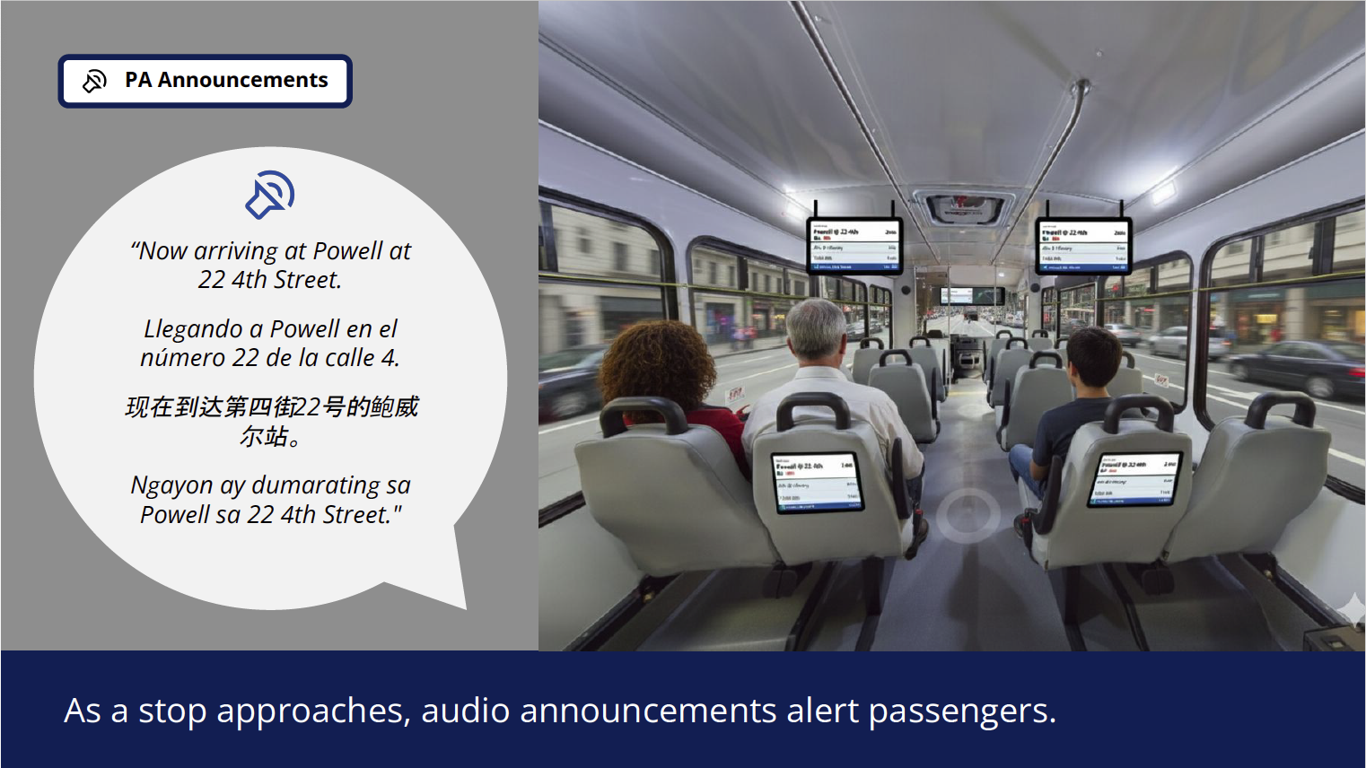
Audio announcements for upcoming stops are important for low vision passengers as well as those who are looking at their phones during the journey.

As a stop approaches, a recorded announcement would play in four languages:
“Now arriving at Powell at 22 4th Street.
Llegando a Powell en el número 22 de la calle 4.
现在到达第四街22号的鲍威尔站。
Ngayon ay dumarating sa Powell sa 22 4th Street."

As new passengers board at the stop, a recorded announcement would play in four languages:
“This is the Mission Bay Shuttle Line C. Next stop, 4th at Library.
Esta es la línea C del transbordador Mission Bay. Próxima parada, 4ta en la Biblioteca.
这是 Mission Bay 穿梭巴士 C 线。下一站是图书馆,第四站。
Ito ang Mission Bay Shuttle Line C. Susunod na hintuan, ika-4 sa Library.”

General Transit Feed Specification (GTFS)

Maximizing the information provided via GTFS to third-party mapping tools, like Google and Apple Maps, has many benefits. First, it meets users where they are. Instead of requiring riders to download a new app, providing detailed information via GTFS promotes a better rider experience without asking them to change their existing habits. Secondly, using the existing features of these apps allows us to provide users with a large portion of the information we would hope to provide in a MBS app in future. If stops are labeled more accurately, users can leverage features like Google’s AR routing to find stops. Feelings of trust and dependability will be enhanced through live shuttle ETAs and clear alerts for canceled or detoured shuttles.  Audio announcements for upcoming stops are important for low vision passengers as well as those who are looking at their phones during the journey.

In particular, we recommend the following GTFS information be shared.

The Redesigned User Experience

Shuttle mock ups created using Google Gemini and Photoshop.