R+C Website Redesign

Rutherford + Chekene, a structural engineering firm, needed a modern digital presence to support their expanding recruiting efforts and business development initiatives. Their existing website no longer reflected the quality and innovation of their engineering work, creating a disconnect between their professional reputation and online presentation.

This comprehensive redesign project was structured from the outset to span multiple phases, with a planned handoff to external consultants for development work. The final result gives R+C a fresh, modern digital presence that positions them as a forward-thinking 21st century engineering firm.

Defining the Target Audience

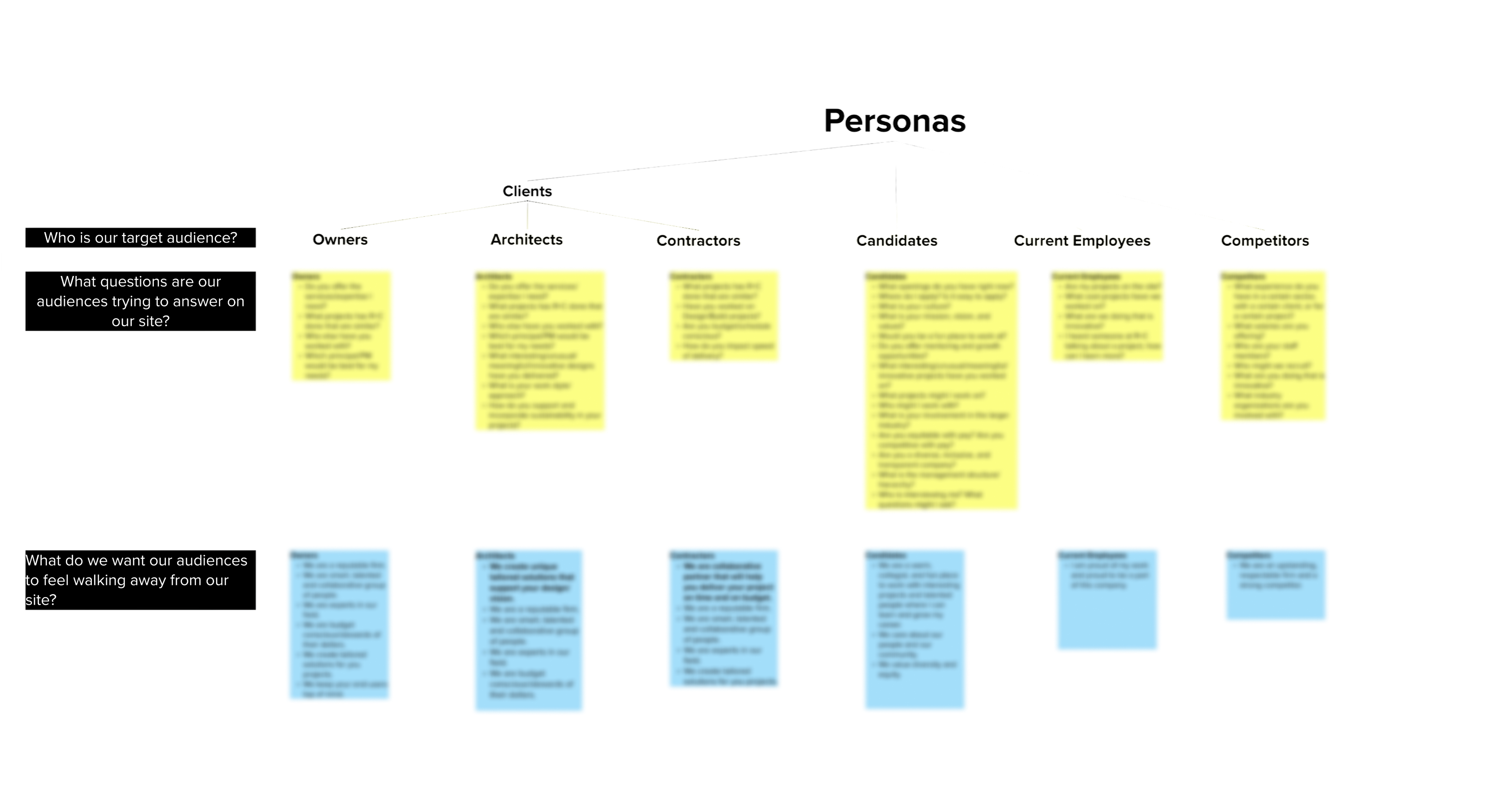
To ground the redesign in real user needs, I defined the website's target audiences through a persona-based exercise. After listing the site's different audience segments, I facilitated a brainstorm on the questions each audience might be seeking to answer when visiting the site, and what impression we wanted the site to leave with each of them. My team then reviewed this with the firm's head of business development and head of human resources — the two stakeholders most directly involved in client communication and candidate/employee communication, respectively. The resulting chart became a foundational guide for what content to prioritize on the new site and what messaging should run through it.

Messaging

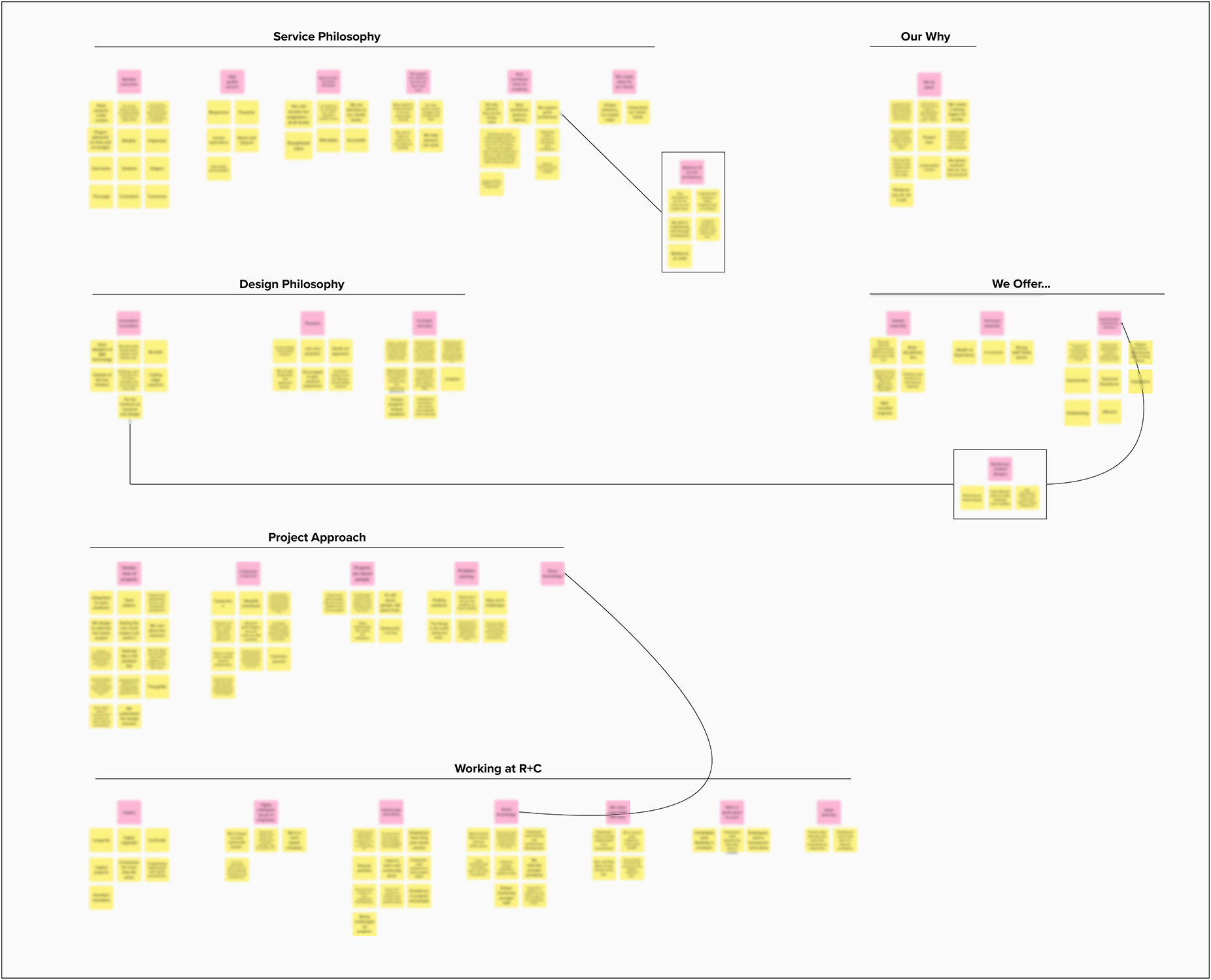
Since a full branding process was outside the scope of this project, I looked for a lightweight way to still ground the new site's messaging in the firm's actual voice. To do this, I ran an affinity diagramming exercise: I pulled transcripts from recent interviews with firm leaders (originally conducted for other purposes) and identified the sections where they discussed the company's brand, values, and purpose, along with the value they bring to clients. I transferred each relevant quote to a sticky note in Mural, grouped the quotes by theme, labeled each group, and organized the groups into higher-level categories.

Information Architecture / Site Map

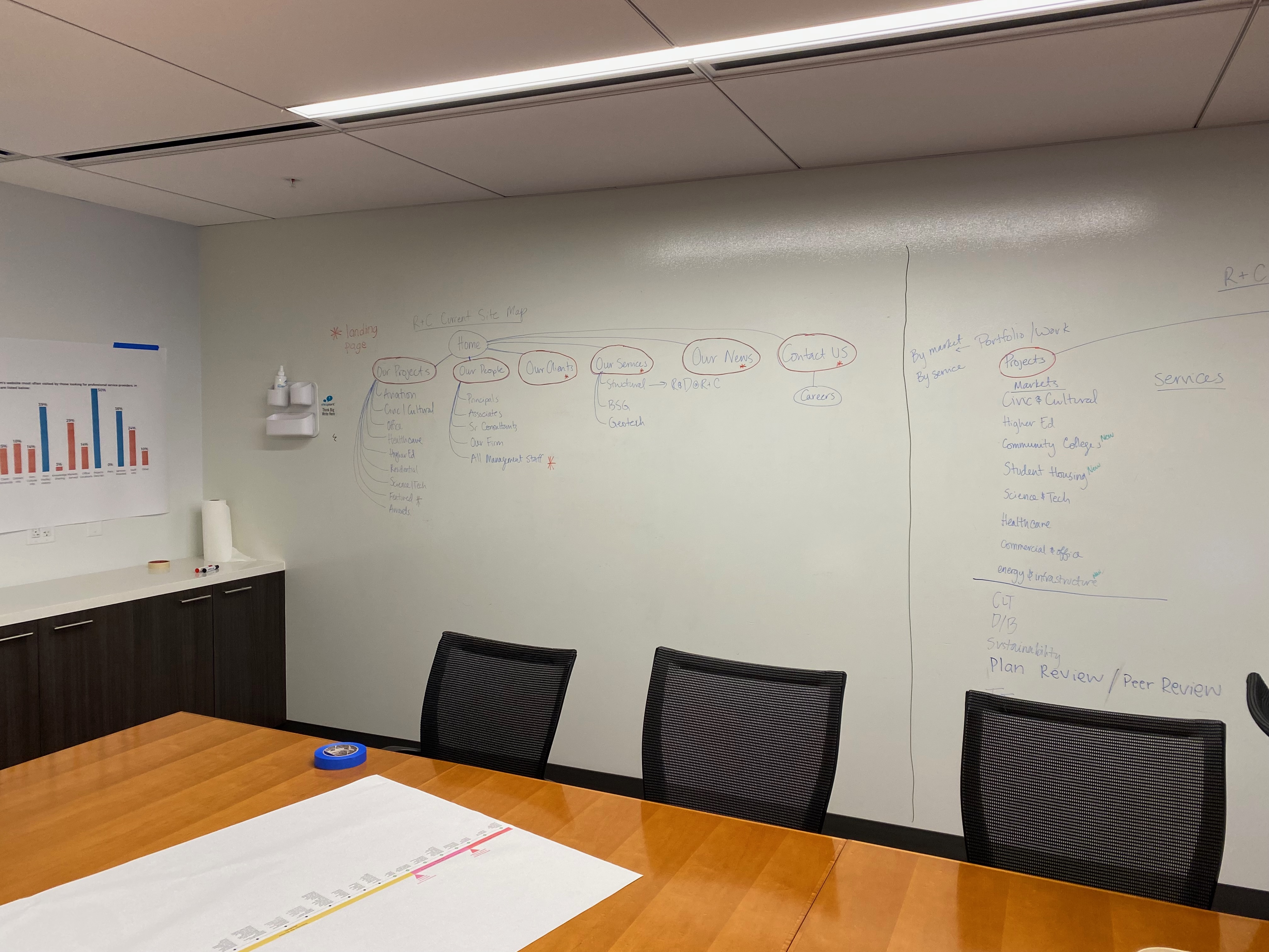
While working with the team to define the audience and messaging, I also audited the existing site to document its current structure and how content was organized. I then convened a team whiteboarding session to discuss what was working, what wasn't, and where we wanted to make changes. Based on that conversation, we outlined a new proposed site map, which was presented to the firm's leadership for review.

Design Phase 1

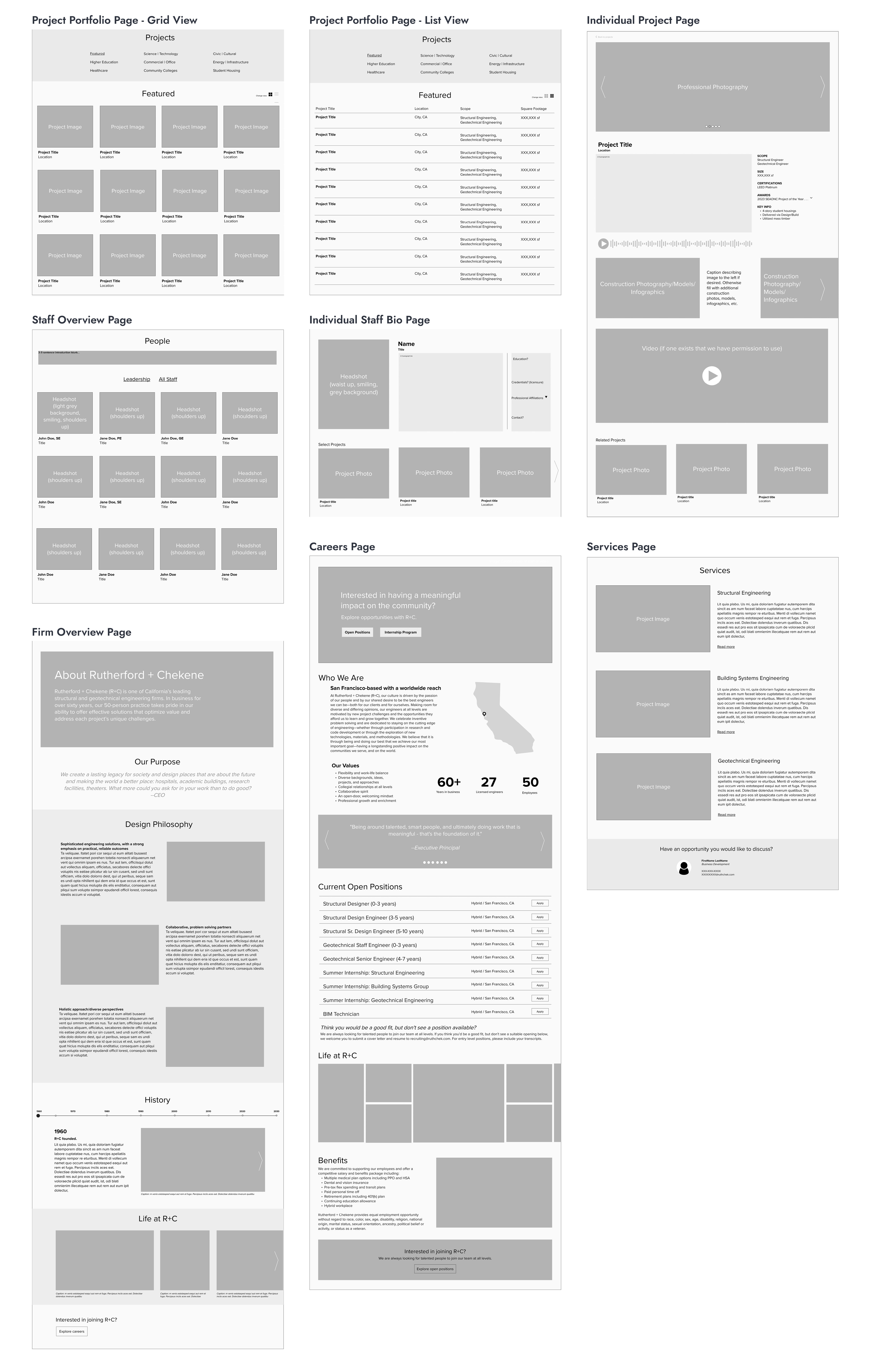
To communicate the team's vision for the new site to our design/development consultant, I began by conducting an informal competitor analysis of close to 20 firms in the industry, studying how similar companies were presenting their work online. Drawing on that research, I sketched initial layouts for each of the site's key pages, then prepared them as conceptual wireframes. I met with my supervisor to review the wireframes, incorporated her feedback, and refined them further.

Once the wireframes were ready, they were handed off to our website design/development consultant, who used them as the foundation building out the new website.
Design Phase 2

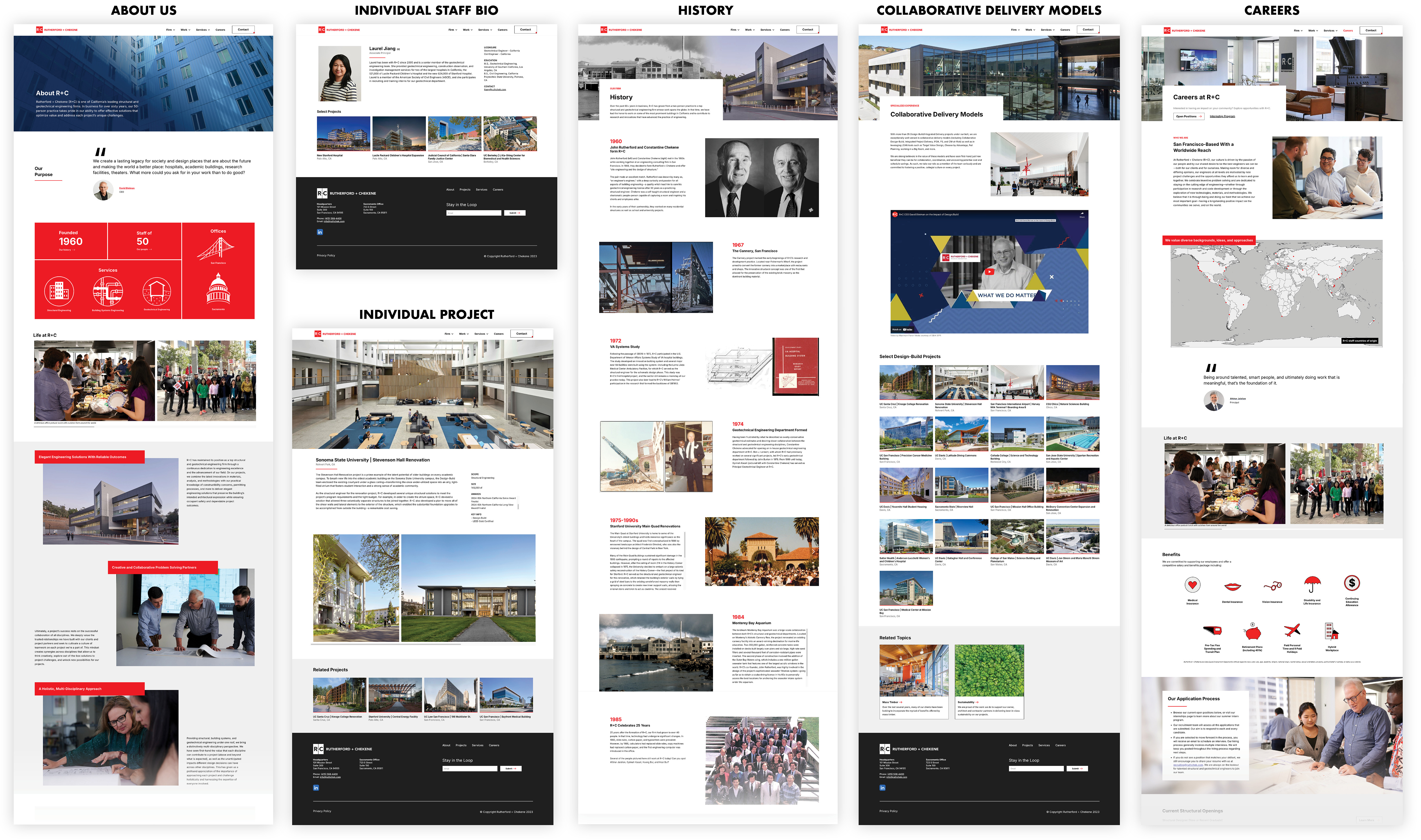
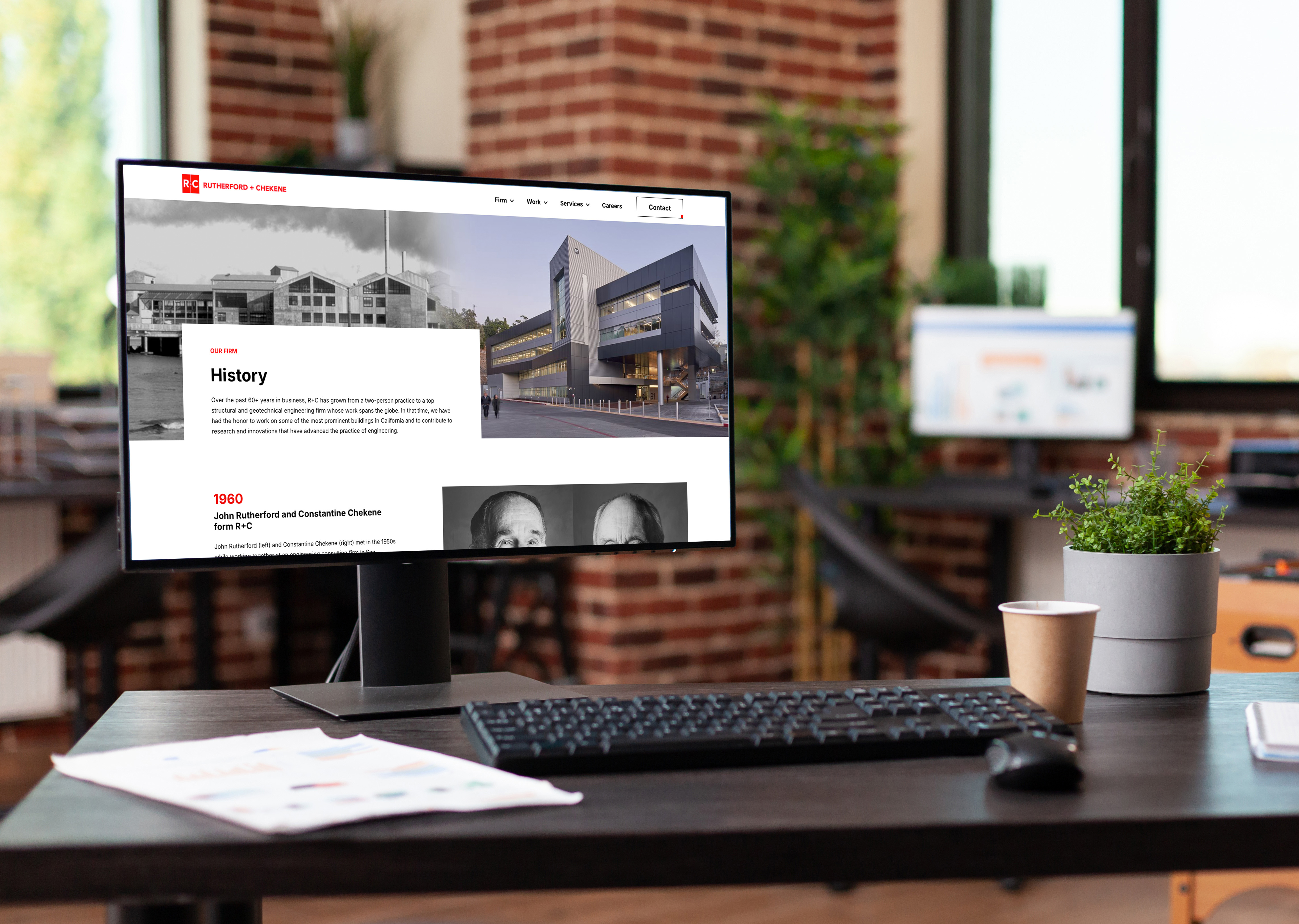
Following the hand-off in Phase 1, I stepped away from the project. R+C later brought me back in as a consultant to continue leading the work. When I returned for Phase 2, the consultant had transferred the content from the previous site into a new, responsive format with an updated visual identity. The next step was to refine the designs for each page and develop the content to fill them.

I significantly redesigned 9 pages and designed 7 new pages to match the updated visual identity, writing the copy for these pages and helping coordinate a photoshoot to update the site's imagery. To implement this work directly, I taught myself Webflow and built out all of the Phase 2 designs in the platform myself.

Icon Design

For the updated About Us and Careers pages, I developed a set of custom icons using Adobe Illustrator.