‍

Becomee

An AI-guided app for getting unstuck: talk it through, try one small thing, reflect.

Becomee is an early-stage app where users chat with an AI agent that guides them through getting unstuck with a simple loop: talk through what’s on your mind, try one small thing, then reflect on how it went.

The product arrived at this focused loop after several rounds of iteration, moving from a more complex, feature-heavy concept toward this simpler core. I contributed to clarifying the product vision around a talk–try–reflect loop, and worked on rebuilding the visual identity and wireframes to create an experience that felt both hand-made and polished, evocative of a bright new journal. Implementation of the redesign is currently underway.

‍Role: I was the solo product designer on Becomee, working in close collaboration with the founder. I helped define the audience and shape the core offering, then led the brand identity and visual redesign—from auditing the existing app through moodboarding, logo development, and a Figma design system, to redesigned screens across the app.
Part 1: Shaping the core concept and value proposition
Defining the target audience
When I came on board, Becomee didn't have a defined target user. There was a sense that it could serve people navigating a significant life change, but I suggested we start by defining the core audience as a way to guide the experience development.

I sat down with the founder, who had already been testing the concept in conversations with potential users, and we looked at where she was getting traction and where the app could offer real value. We landed on women aged 18–35: tech-savvy, open to newer tools, and in the middle of many life transitions. Her past conversations pointed to three use cases:
  • Career transition. Recently laid off or changing direction, feeling lost, and comparing themselves to friends who seem to be moving forward.
  • Breakups. Coming out of a long-term relationship and trying to answer "Who am I? What do I even want?"
  • Dating. Easy to lose yourself in someone new, with pressure from family and timelines to feel "on track."
Narrowing the audience gave us a clearer sense of what we were building and who it was for, and it later became a key driver of the brand identity.
Where the app started: a long intake before payoff
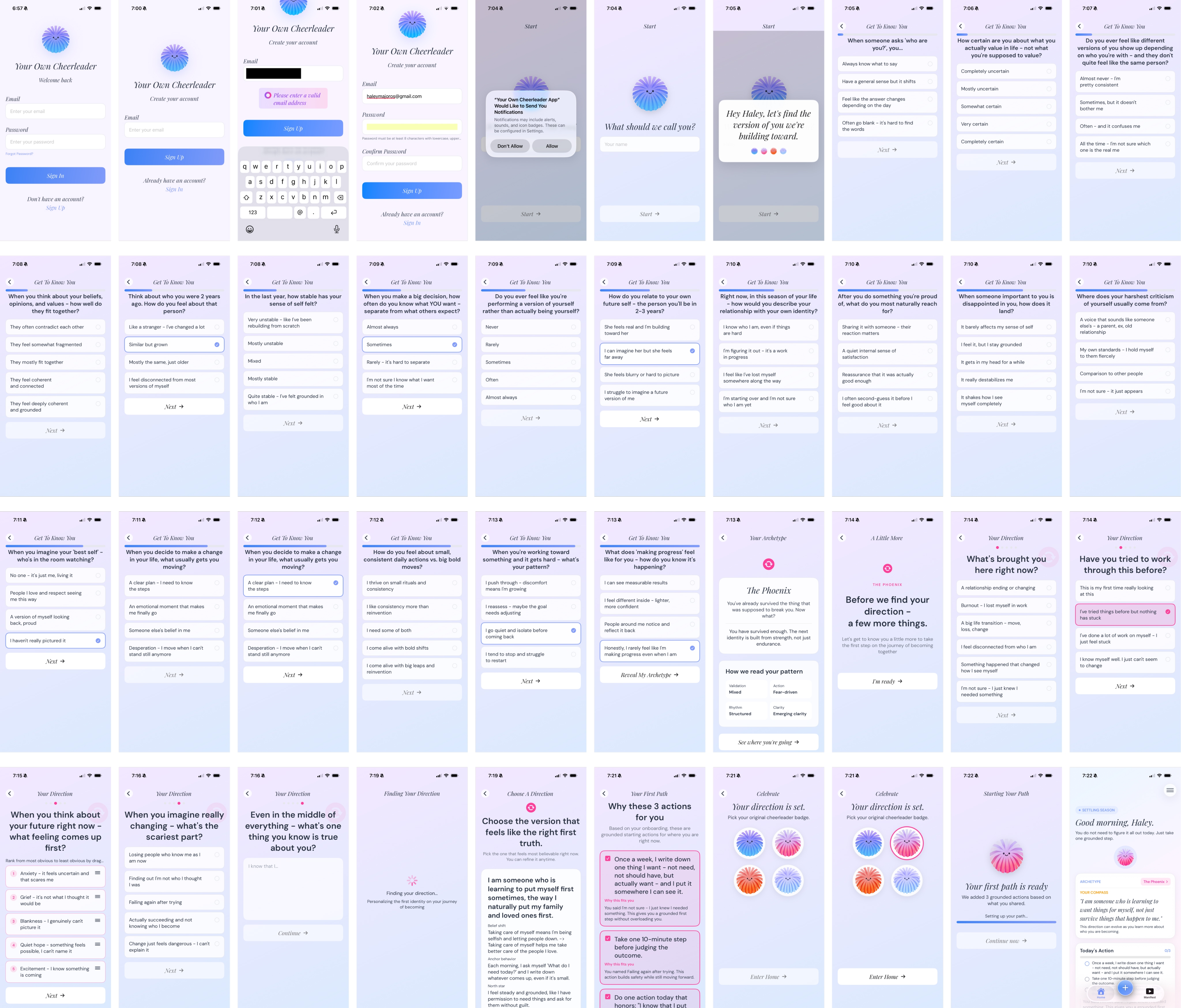
When I joined, the app (then called Your Own Cheerleader) was built around a long intake process. It followed a pattern of diagnose, assign, prescribe:
  • Diagnose. An 18-question "Get To Know You" quiz on identity, self-trust, and decision-making, followed by five more "Your Direction" questions.
  • Assign. An archetype ("The Phoenix"), then an identity statement to choose, such as "I am someone who is learning to want things for myself."
  • Prescribe. Three starting actions and a choice of cheerleader badge, before the home screen.
From there, the app branched into a daily action, a chat, a manifesto, an archetype page, and a reflection check-in that asked users to set their top three goals for the next quarter.

It asked a lot of users at onboarding before they got anything in return. Then, by having them set three goals for the next quarter, it pointed them toward a distant horizon instead of something they could act on today. Together, they created an overwhelming experience for someone already feeling lost.
The original flow: roughly 40 screens from sign-up to home
Concept evolution: three stages to one thing at a time
Our first redesign concept was Ground, Play, Build. It started from the founder’s sketch, and I helped shape it into three stages a user would move through:
  • Stage 1: Ground
    ‍
    A soft landing: an AI agent offering light nudges and emotional support to help users stop spiraling.
  • Stage 2: Play
    ‍
    Designing small experiments to try on new identities, collect evidence, and discover who you are.
  • Stage 3: Build
    ‍
    Turning what you learned into ongoing habits and systems that support your goals.
As we worked through translating this concept into the product, the structure quickly grew complicated, and we realized that it relied on the assumption that people progress evenly in all areas of their life—moving linearly through grounding to play and build. However, in reality, someone might be ready to play in one area of their life while still getting grounded in another.

Of the three stages, Play held the most promise—getting people to take a lighter, action-first approach and to get out and try things instead of over-planning. The founder's next overhaul centered around the idea of doing one thing at a time, cutting overthinking down to a single small next step.

Around that core, the app was reframed around time:
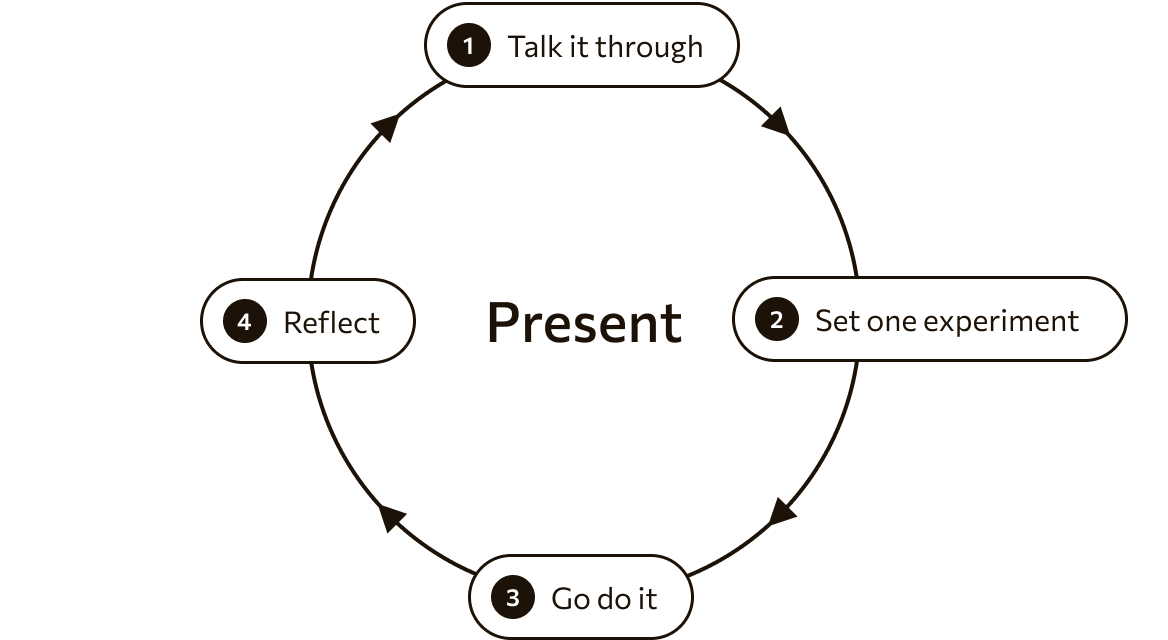
  • Present: The whole loop lives here: talk through what's on your mind with the agent, set up one small experiment, go do it, then come back to reflect on how it went.
  • Future: A vision board for picturing who you want to become.
  • Past: A log of past conversations and what came of them.

The result was a clear core: talk it through, try one small thing, and reflect on how it went. Where the original app opened with 23 questions and quarterly goals, the new one opens with a single question and ends with one small action.
Selecting one central metaphor
The overhaul had also brought a new vocabulary. The area where users talked through what was on their mind and set up an experiment was called "The Space," but the name was vague—it sounded open and unlimited, which set the wrong expectation for users. In reality, it was a focused chat that funnels users toward setting up one small goal to act on soon.

Rather than rename it, I suggested removing the name entirely. Not every feature needs a name, and this one already lived under the Present tab, so a second name only added complexity. Instead, we edited the text of the lead-in page to give users a better idea of what to expect. We applied the same methodology across the app.
Part 2: Crafting the visual brand and user experience
Auditing an AI-generated patchwork
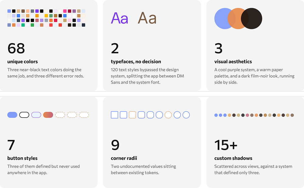
With the concept steadier, we turned to the visual design. The app had been vibe coded, and each round of generated code brought new screens with their own styling which wasn’t always tied back to a shared system. Over several iterations, that created a patchwork with three different competing aesthetics and many one-off treatments.

To see the full picture, I used Claude to inventory every color, typeface, spacing value, icon, and component in the codebase, then used the Figma MCP to output the findings as a visual I could evaluate.

Due to the extent of the inconsistencies the audit surfaced, we decided to focus on starting fresh and defining the new brand identity instead of spending time trying to clean these up in the code.
Finding the brand personality—from calm and serene to joyful and energetic
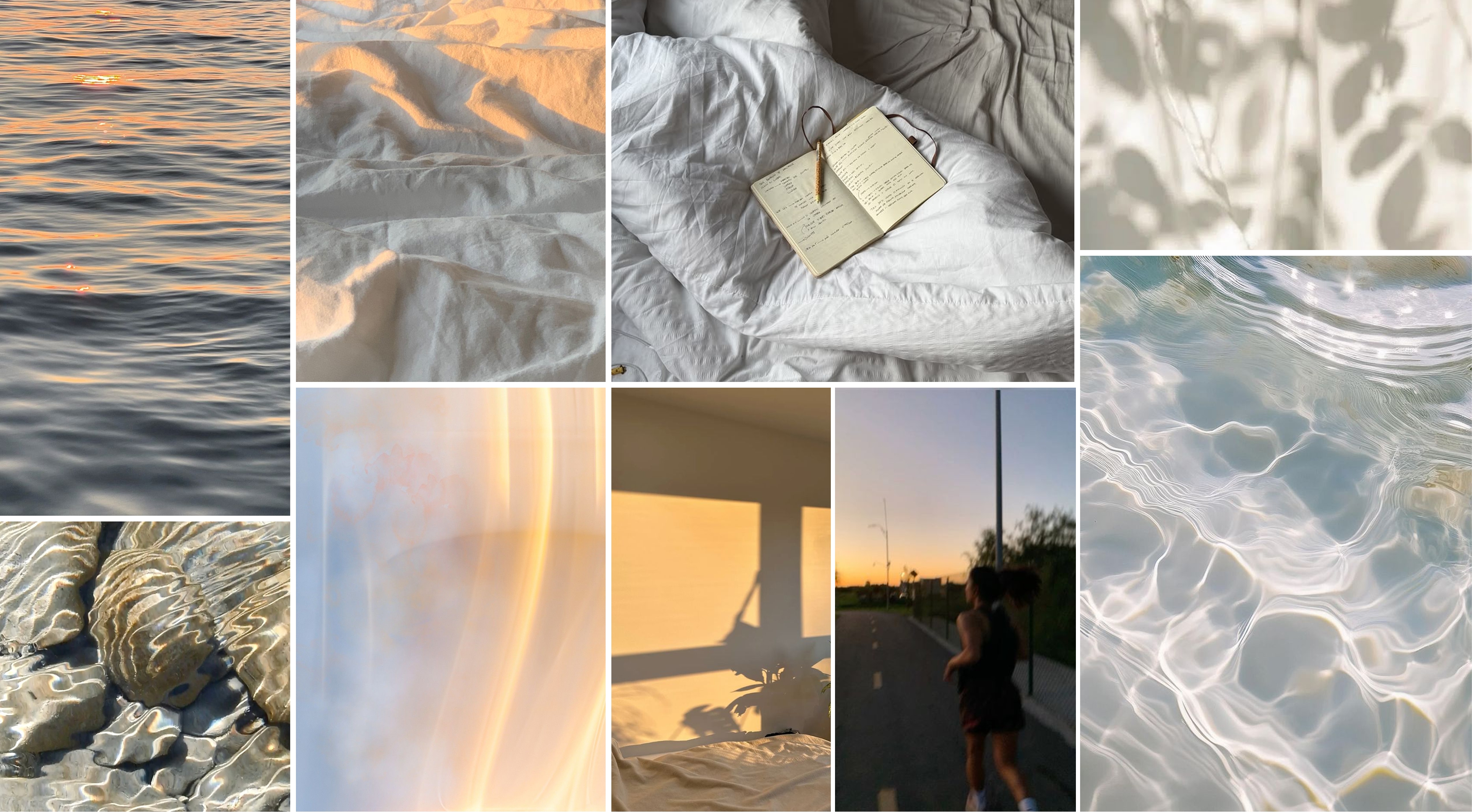
When we first began conversations about the brand, we were most focused on creating a sense of calm and quiet—a reflective, grounding moment for people going through hard transitions. Our first moodboard featured soft light, morning sunrise, and gentle ripples.
Initial moodboard
However, once we settled on the “one small action” concept, I began to sense a disconnect. As I explored applying the moodboard to the product, it didn’t quite fit, even after several iterations.

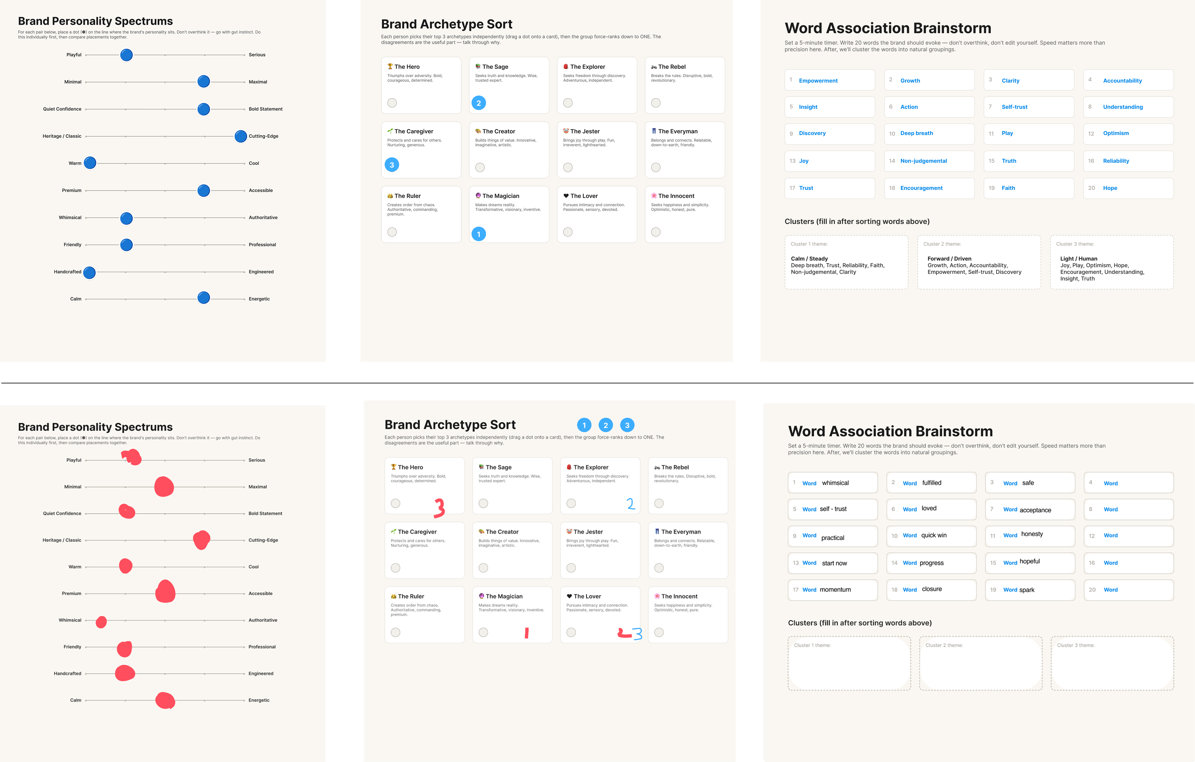
So I went back to the foundation. I used Claude to create 3 quick brand definition exercise pages to serve as a starting point for us to discuss. I had us each fill them out separately before meeting. The exercises themselves surfaced a major mismatch—words like safe, acceptance, and closure alongside quick win, start now, and momentum.

The conversation we had after comparing our answers opened up an entirely new direction. Becomee was about nudging users into action and to match this, the brand should feel joyful, vibrant, and lively. Our top-ranked archetype, the Magician, also pointed in this direction—towards transformation and optimism.
After our discussion, I gathered a wide set of images and together we sorted them into yeses, maybes, and nos. From the yes pile, I narrowed the new direction down to three guiding images. Each was vibrant, full of movement and texture (including hand-drawn elements), and saturated with pinks, yellows, greens, and blues.
Final moodboard
A butterfly: one metaphor for the brand
We set the brand direction around growth and transformation, and explored a few ways to express it, such as flowers, plants, and a butterfly. Flowers and plants spoke to growth, but the butterfly really represented becoming a better version of oneself, which we ultimately felt was more representative of the experience the product was creating.

For the name, the founder came up with Becomee (become + me), extending the same idea of self-discovery and transformation.
Designing a hand-made identity for an AI product
Our vision for the new identity was to evoke the feeling of a bright new journal. We wanted the interface to have touches that felt personal and hand-made, yet polished. With the butterfly as a central theme and a target audience of women 18-35, we were comfortable leaning into a feminine feel, but wanted to provide a bit of interest and tension by balancing this with some more angular elements.
  • Type. I chose Alegreya for its calligraphy-inspired letterforms, which bring warmth and a journal feel. In places, they're also angular and sharp, which serves as a counterpoint to some of the softer brand elements.
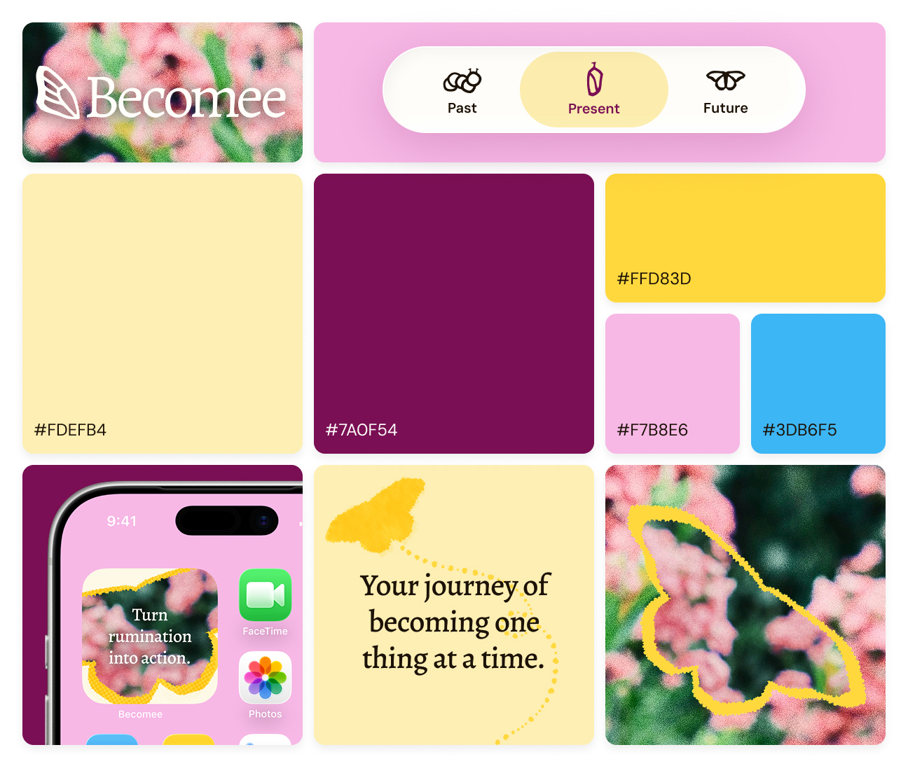
  • Color. Drawing from the moodboard, I chose a palette of butter yellow and a deeper, grounding plum alongside a bright yellow, pink, and blue. Together, the palette feels energetic and joyful, without tipping into saccharine.
  • Texture. As a contrast to many of the overly-slick, AI-generated designs circulating today, I incorporated a variety of textures to give the brand a hand-crafted touch, such as torn-paper edges, halftone overlays, and grainy, film-like photography.
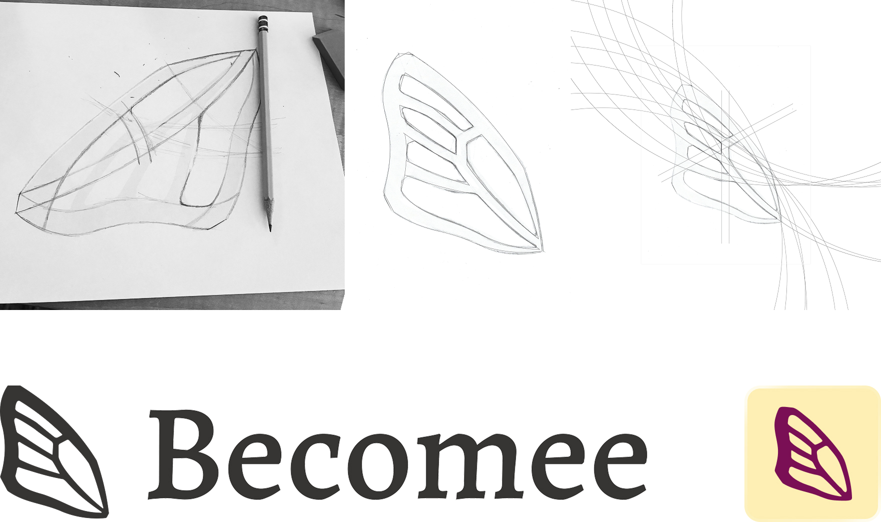
  • Logo. After exploring different options, we decided on a single segment of a butterfly wing for the logo mark, which felt a bit unexpected and had geometric quality that I accentuated to mimic the angular quality of the Alegreya font. I also matched the widths of the logo mark to the letterforms in Alegreya, so they flowed together well.
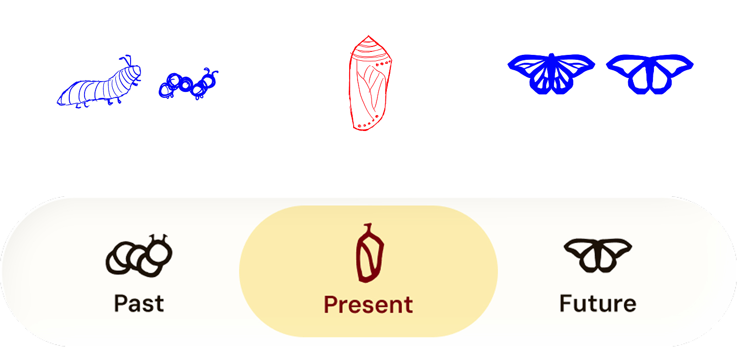
  • Navigation icons. The butterfly metaphor is also present in the app’s navigation where the Past, Present, and Future tabs are marked by a caterpillar, a chrysalis, and a butterfly. I designed each of the icons to carry the same geometric, angular quality as the Alegreya typeface and the logo.
Becomee logo development
Navigation icon development
Final Becomee brand system
Part 3: Translating the rebrand into the product
Going back to mid-fi before moving ahead
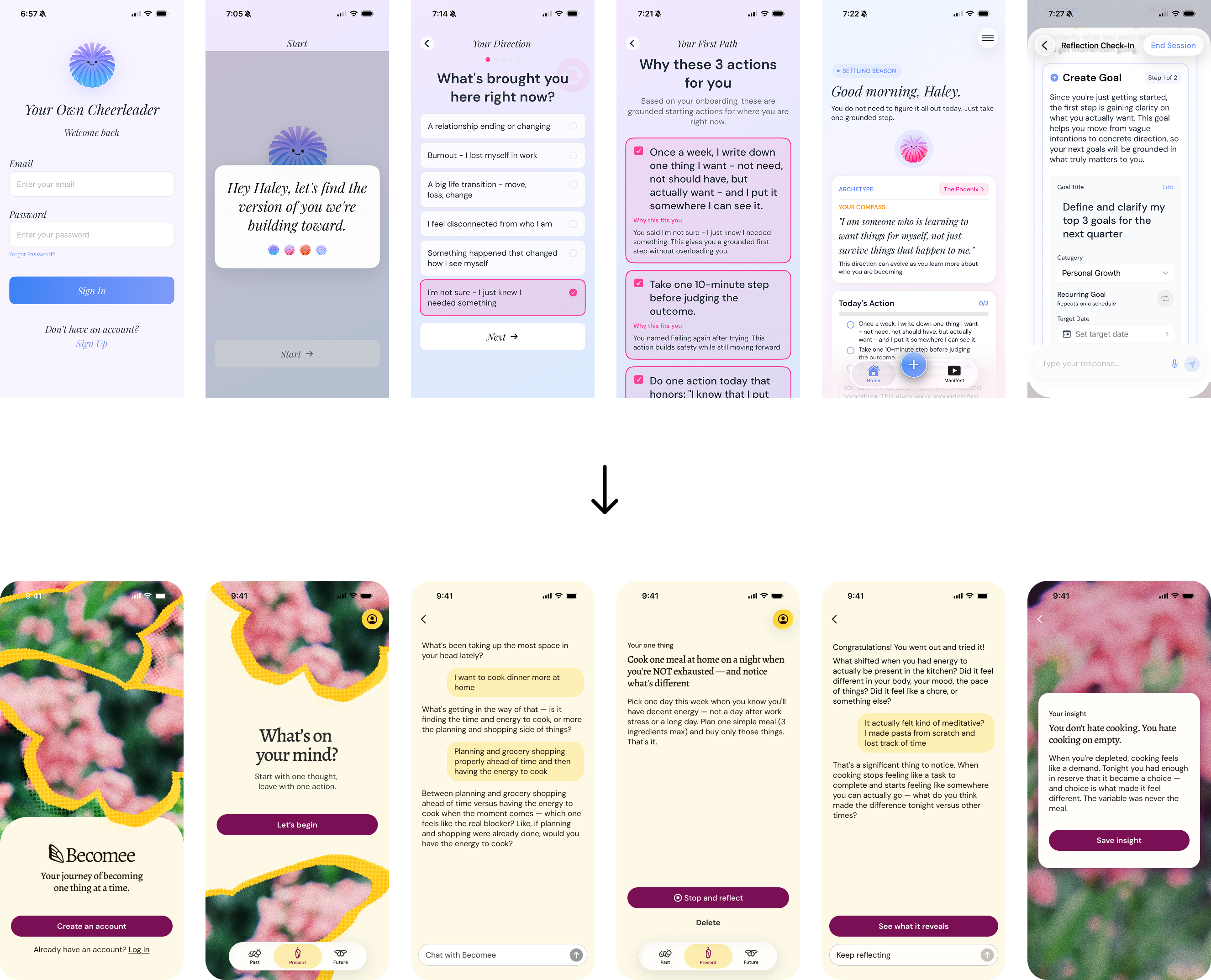
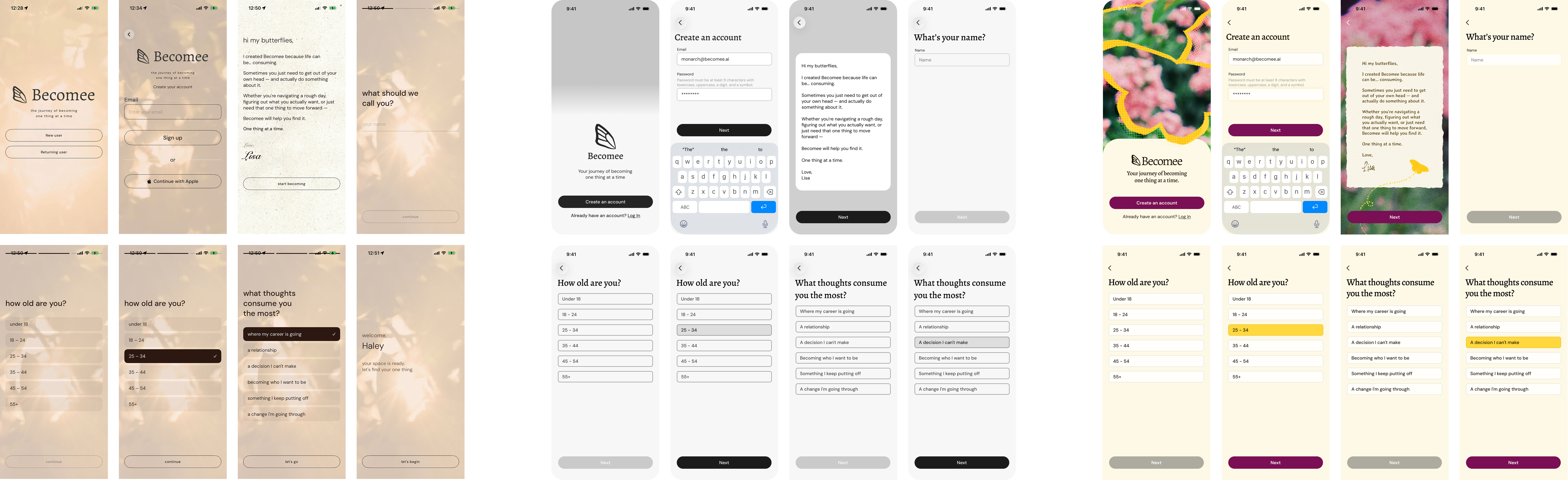
Given the inconsistencies that the audit had uncovered, rather than just repainting the existing screens by switching the hex values in the CSS, I rebuilt each screen in Figma, so that I could ensure consistency and adjust flows where needed. I worked in three passes:
  • Capture: I screenshotted every key screen in the live app.
  • Strip it back: I rebuilt each screen in black and white in Figma, revising flows where needed until I had a clean version.
  • Apply the brand: Only then did I layer in the new colors, typography, and brand illustrations.

Working this way let me keep structure and style separate. I first focused on adjusting the flows, then layering in the visual elements.
Deciding where personality belongs
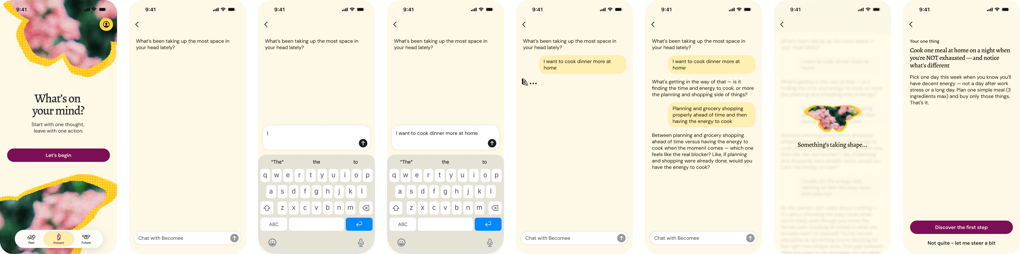
A brand built on saturated color, texture, and hand-drawn illustration can quickly crowd an interface, so I chose moments of personality with care. The empty/loading states and intro screens carry the brand's texture and illustration, setting the tone as users enter each tab. Meanwhile, the chat, where users focus on the actual work of the loop, stays clean and minimal.
The central experiment creation loop features a clean, functional inteface with select moments of personality.
Ensuring consistency: creating a design system
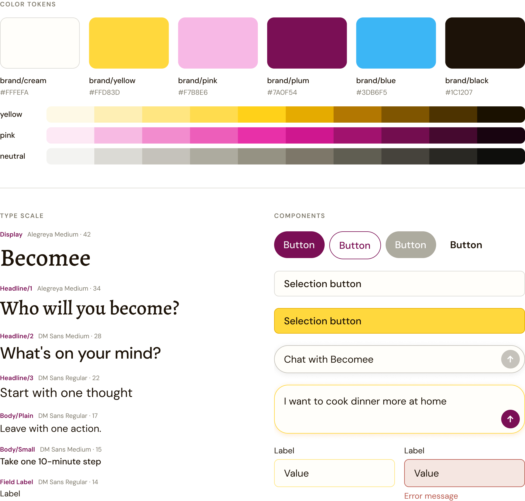
To keep the app from drifting back into a patchwork as it was built, I created a design system in Figma to serve as a shared source of truth: a type scale, color tokens, and components for key parts of the app. The team now has one defined palette and one type scale that can be translated into a design token file for AI coding tools to reference, so new screens stay on brand.
Becomee design system
Reflection
Designing inside a fast-moving product
Becomee is an early-stage product, and being willing to test, learn, and iterate rapidly was an important part of the process of the product finding its footing. Additionally, because the app was vibe coded, each round of generated code could also shift the design and the design lived in code, rather than in a Figma file. Because of that, working in phases was key.

In the early weeks, the concept was changing rapidly, so I focused my time on providing feedback on the concept itself, rather than cleaning up screens and pushing pixels. I waited until the concept felt steady to turn my attention to the rebrand and visual design and chose that moment to bring designs back into Figma to be able to evaluate the user experience holistically.

To keep the redesign from slowing the product development down, I primarily focused on where it would have the most impact: the core Present tab and the visual rebrand.

This project taught me to stay flexible and adapt as the vision changed. Working in shorter, prioritized cycles let me keep pace with everything else happening in the product, and staying open in this way got us to a place neither of us could have imagined at the start.