Musea

A real-time AI audio guide that builds a personalized narrative thread from how visitors actually move through an exhibit.

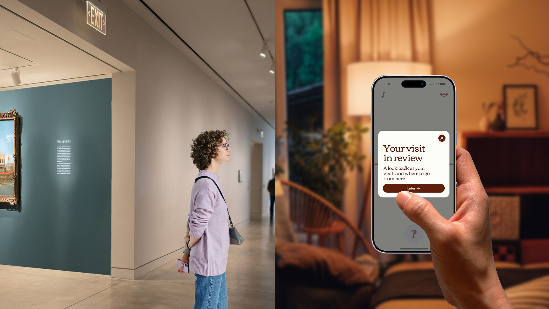
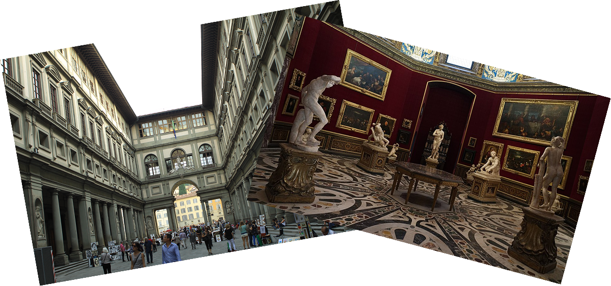
On a recent trip to Florence, standing among the hoards of other tourists crowding the Uffizi Galleria, I watched people wander—looking lost and sporadically snap a photo of a painting (that they will probably never look at again) before quickly moving on. While I was supposed to be absorbed in the art, instead I found myself daydreaming about how the experience could be improved. This inspiration led to me spending the next 10 weeks designing Musea—an app designed to make engaging with art more accessible for the novice visitor.

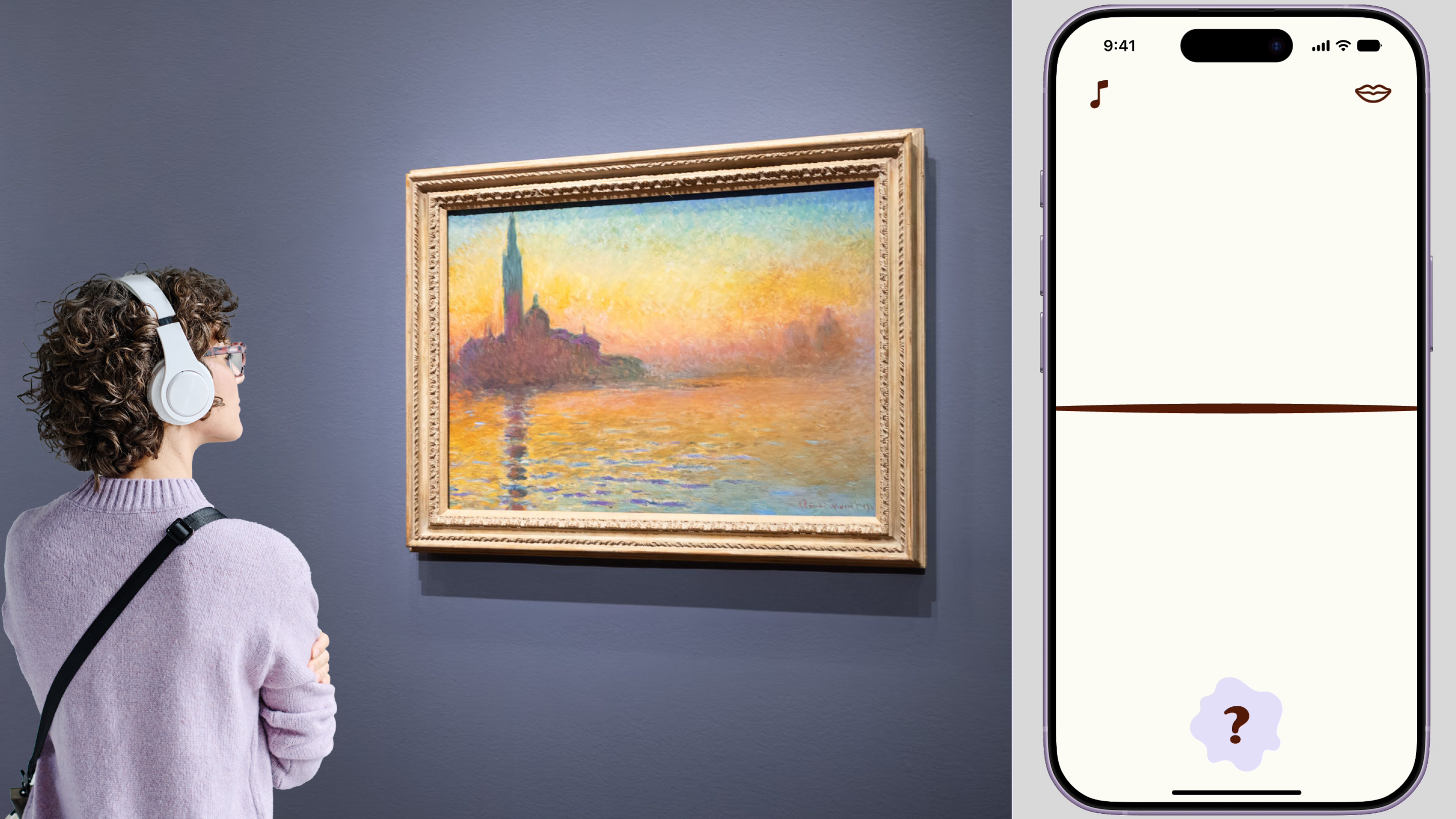
Musea functions like a personal docent, giving each visitor the right context in the moment and adapting content based on how the user actually moves through an exhibit. Using AI, it draws on an exhibit's curatorial storytelling and content database to generate a personalized audio experience in real time—one that accounts for which pieces a visitor has seen, in what order, and which questions or topics they've explored—tailoring the narrative so every visitor can still easily follow the overall thread.

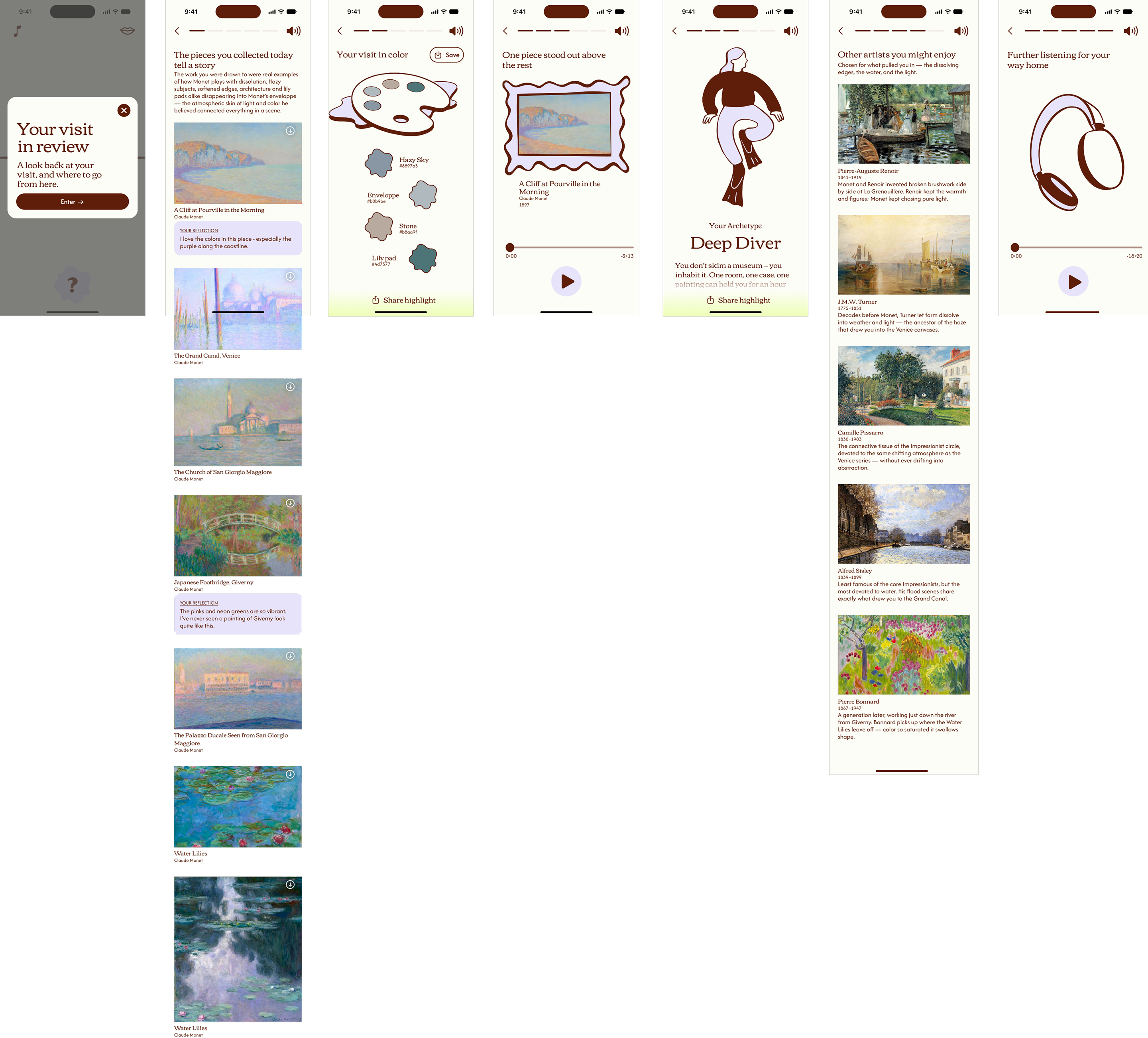
In addition to the in-gallery experience, Musea also helps visitors reflect on and savor their trip through a mid-exhibit reflection and a post-exhibit summary.

Preliminary testing indicates strong interest in this system—with people particularly enjoying the gesture interactions, adaptive content, and after visit summary.
The problem
For the casual museum visitor, the traditional museum experience can feel overwhelming and dull—long text, endless facts and dates, and hard to follow storylines. Instead of being the spark for ongoing learning and engagement with art, this experience often leaves visitors feeling drained. Research shows that most visitors only spend 30 seconds with each piece on average and stop at 20-40% of the pieces in an exhibit. However, when people skim and skip around this way, they often lose the curator's intended narrative thread and the cognitive load of trying to keep up leads to fatigue.
Audience
Casual Museum Visitor
  • Visits a museum 1-2 times per year 
  • Is interested in art, but doesn’t have formal education on the subject
  • Starts off enthusiastic and thorough, then get fatigued and disengages
Project goal
Solution Criteria:
  • A flexible system that can be adopted by many museums
  • Operate within a traditional museum environment without requiring major infrastructure changes
  • Use digital interventions as a compliment to enhance discovery—not distract from the art
  • Allow visitor curiosity to drive discovery
Scope and Constraints:
This was a solo 10-week-long project focused on designing an end-to-end visitor experience.
Assumptions:
This concept assumes reliable wifi and feasible proximity-based interaction (e.g., near-field Bluetooth).
Solution concept
Musea is a 3-part system which includes an AI-enabled personal guide, a mid-point physical rest area and corresponding digital experience, and a delightful after visit summary reveal.
1. Personal guide
At its core, the personal guide uses AI to give every visitor a more bespoke experience. A traditional audio guide only covers a selection of pieces, which either restricts visitors to that path or leaves them without context for anything else. With Musea, every piece has an accompaniment, so visitors can move freely without losing the thread.

That accompaniment is also personalized to each visitor's path. Musea keeps track of content each visitor has already covered, so it never repeats context unnecessarily. It can also call back to pieces previously seen or it can emphasize different aspects of the same piece (such as its process, personal relationships, or historical context) based on what a visitor has shown interest in (determined by time spent at a piece, questions asked, content listened to or skipped, or reflections submitted).

And, because the input content is built in collaboration with the museum, Musea stays grounded in the story and messages the exhibit's curators intended to tell.
A RAG-powered AI docent, grounded in the curatorial narrative lets visitors follow their curiosity without losing the thread of the story.
How Musea AI Works:
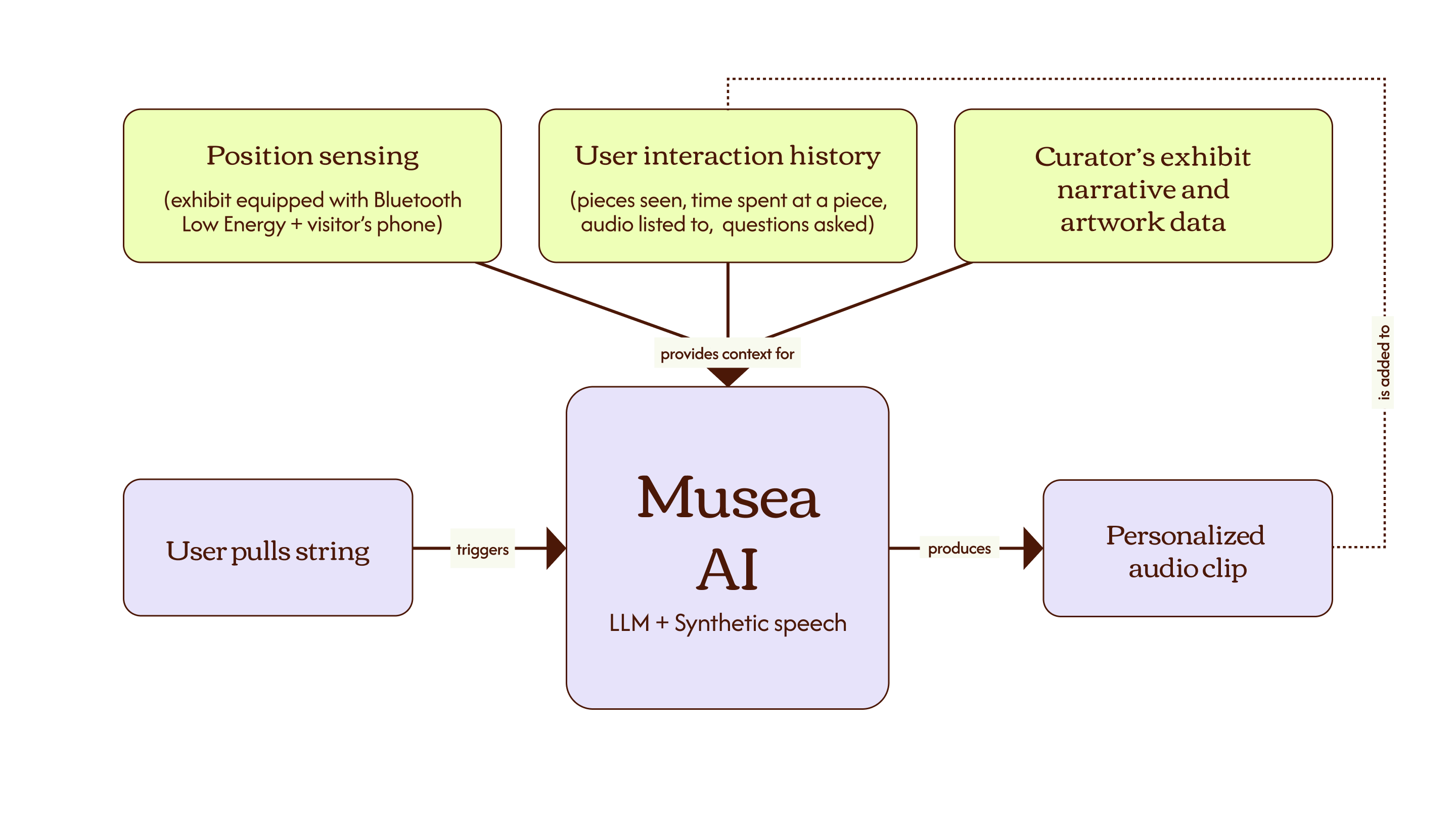
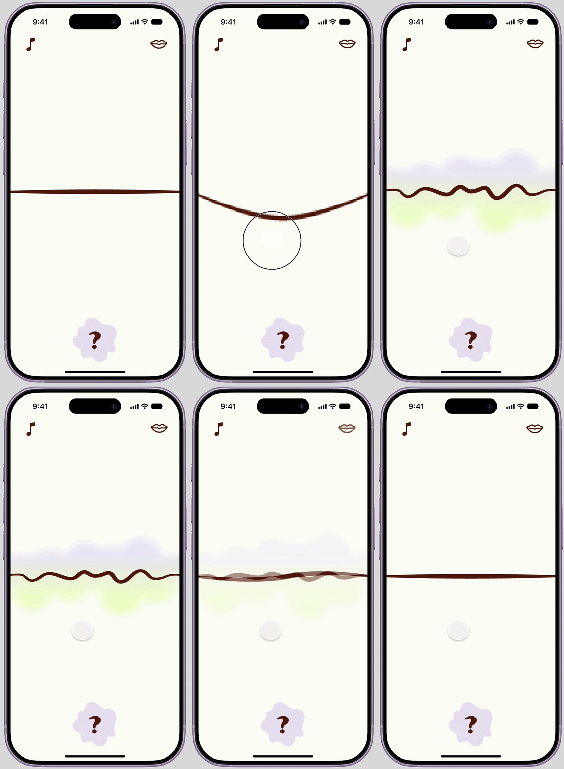
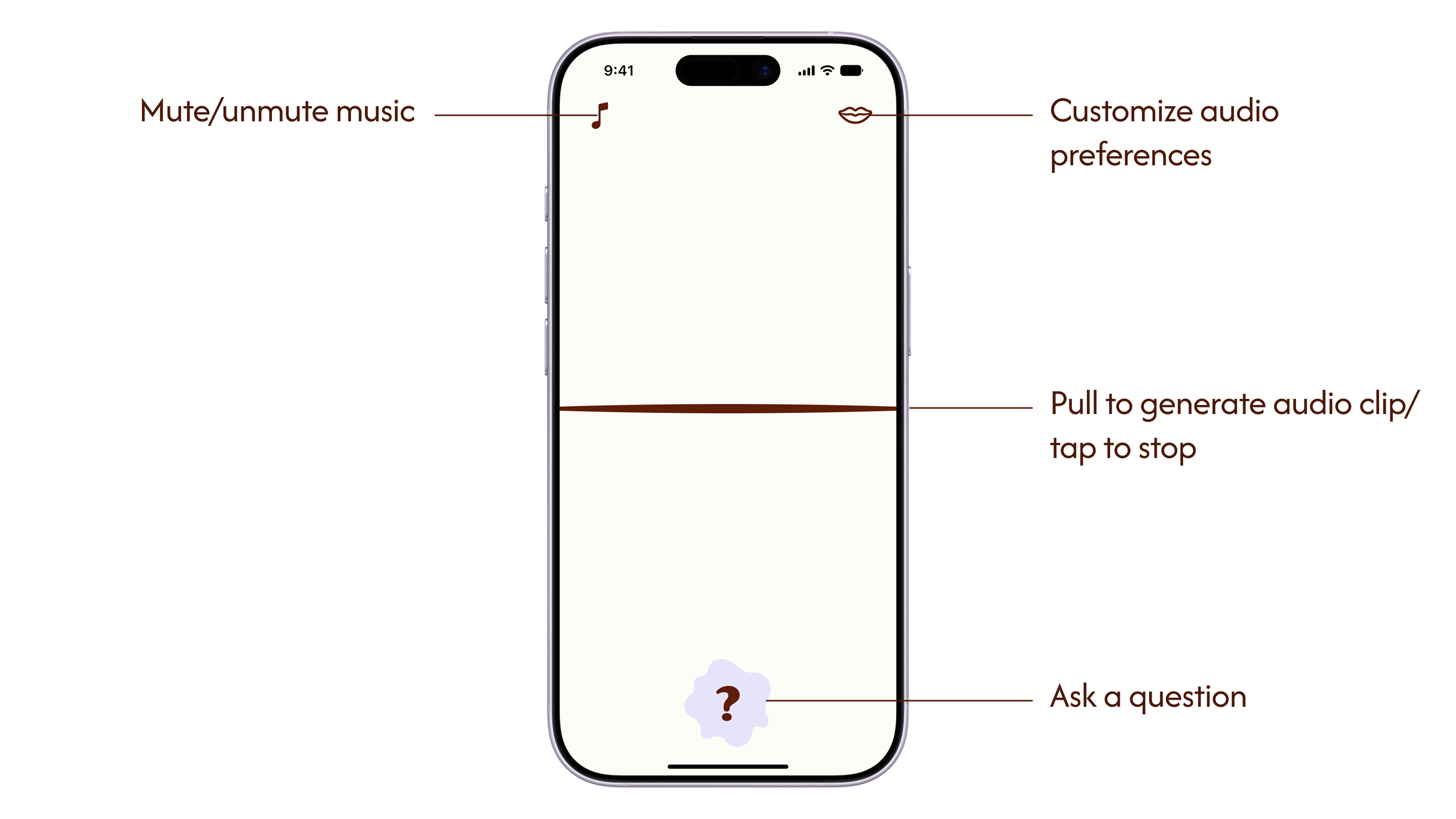
Visitors trigger the agent by pulling the string in the Musea app. The agent then draws on three sources of context: the visitor's location in the exhibit, their activity history (pieces they've viewed, audio they've heard, questions they've asked), and the curator's exhibit narrative and artwork data. From this, a large language model generates a personalized script, which is converted to synthetic speech and played back to the visitor as a custom audio clip.
Adaptive audio is personalized to each visitor’s path and interests.
How Adaptive Audio Works:
Musea's personalized path works by building a visitor profile implicitly as they move through an exhibit: which pieces they stop at, how long they stay, what questions they ask, and what content they listen to versus skip. This is done purposefully to avoid creating friction at the start of the exhibit. Asking visitors to state preferences up front creates a barrier for them to begin and creates confusion—a novice visitor likely doesn’t know where their interests lie before they begin.

That profile shapes the depth and emphasis placed on different kinds of information going forward—such as leaning into process, personal relationships, or historical context. However, Musea does not prescribe where the user should go next in the exhibit as this could erode visitor agency and engagement. Instead, Musea prioritizes visitor curiosity by making that the driver of which pieces the visitor engages with, then providing information to support their interest.
Gesture controls and ambient sensing keep visitor’s attention on what matters most—the art.
2. Reflection Zone
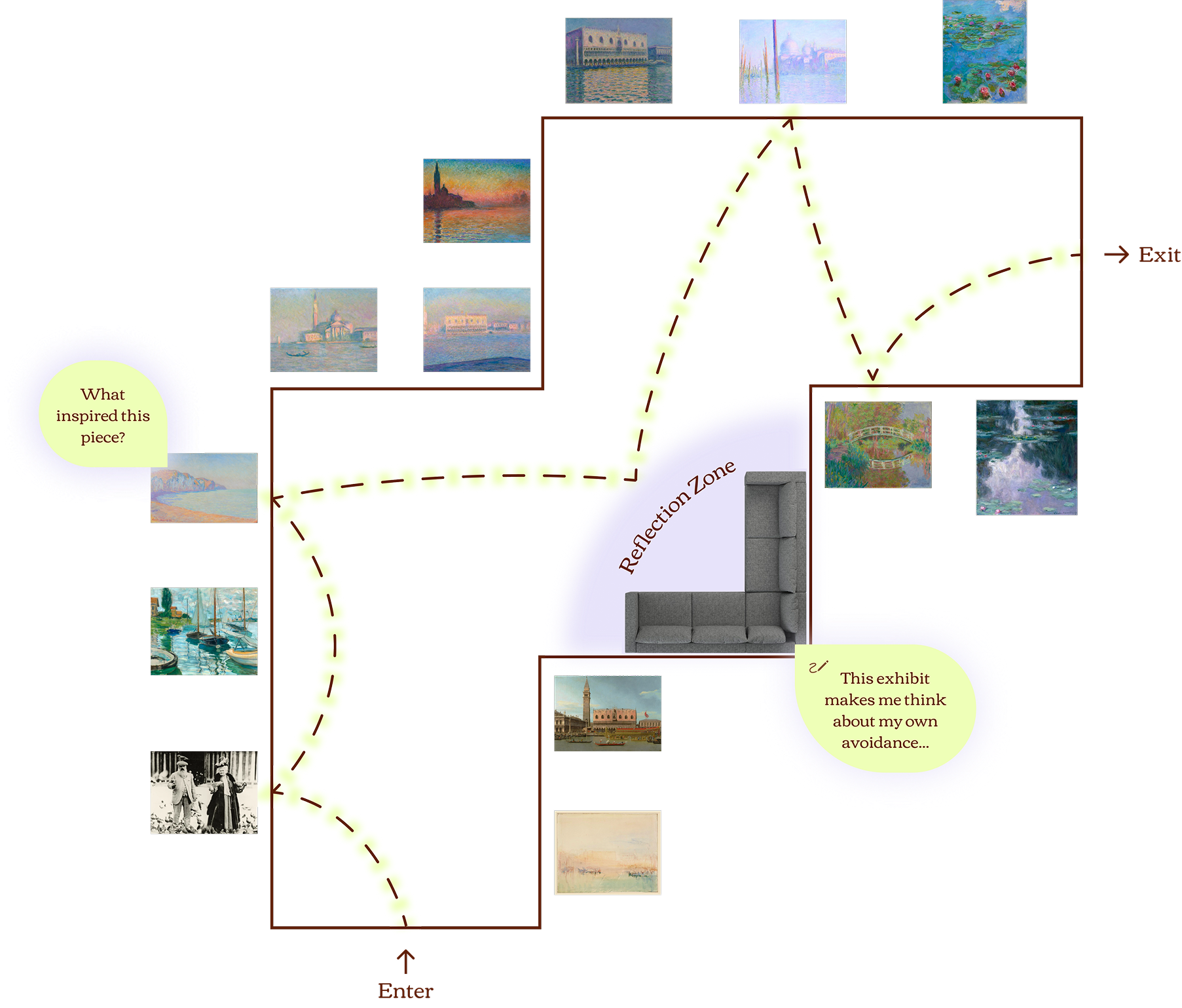
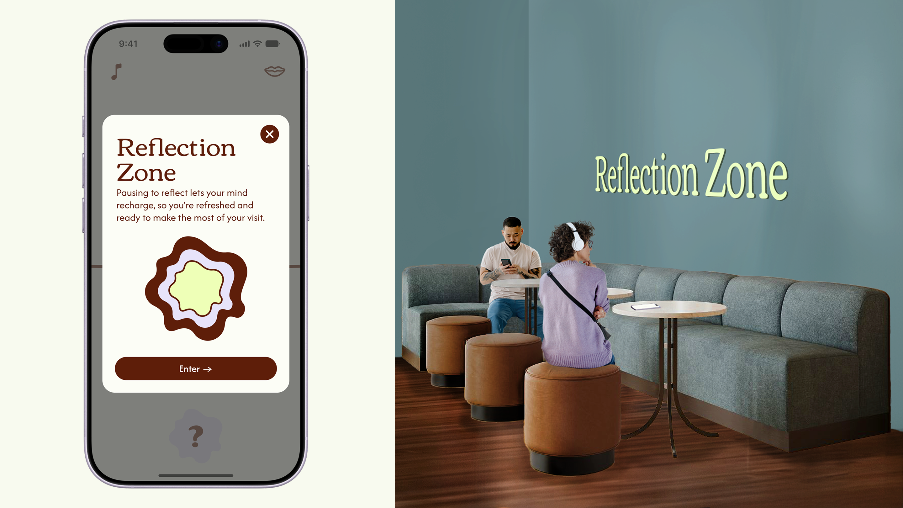
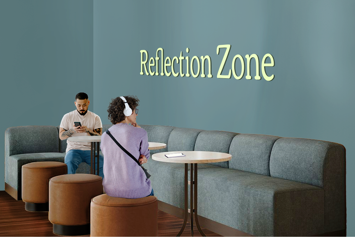
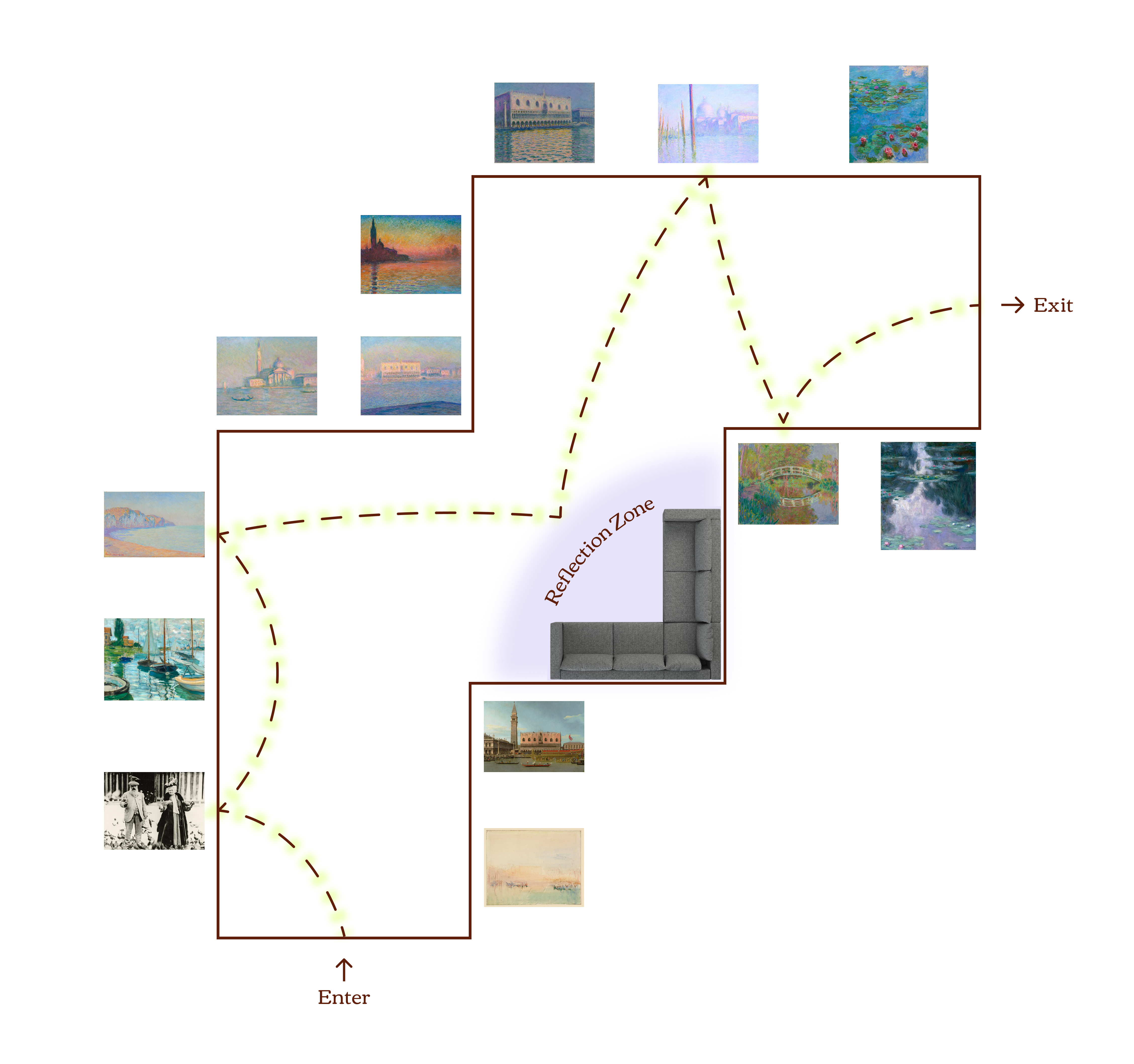
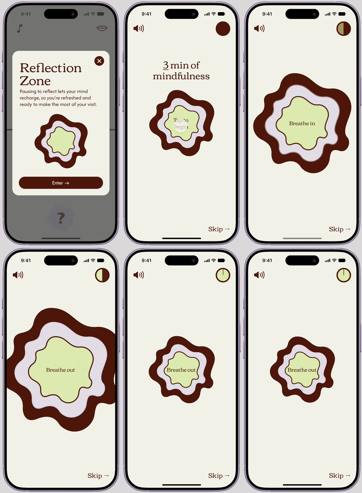
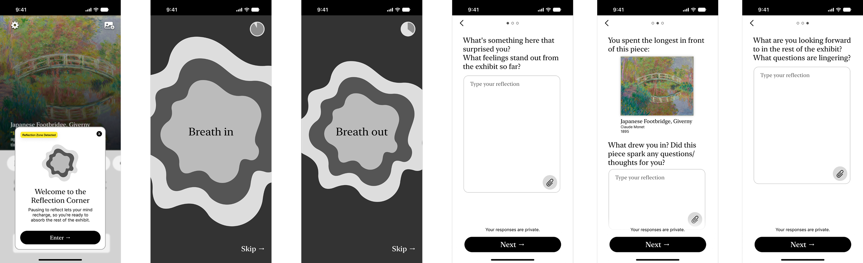
At the mid-point of the exhibit, visitors encounter a physical reflection space paired with a companion digital experience. As they near the physical rest area, the app detects their proximity and invites them to begin the digital experience.

The goal of this part of the experience is to combat museum fatigue (the cognitive overload that sets in after taking in piece after piece) by encouraging people to pause the stream of new content and actually absorb what they've seen.
Proximity sensing triggers the digital reflection experience automatically as visitors reach the rest area.
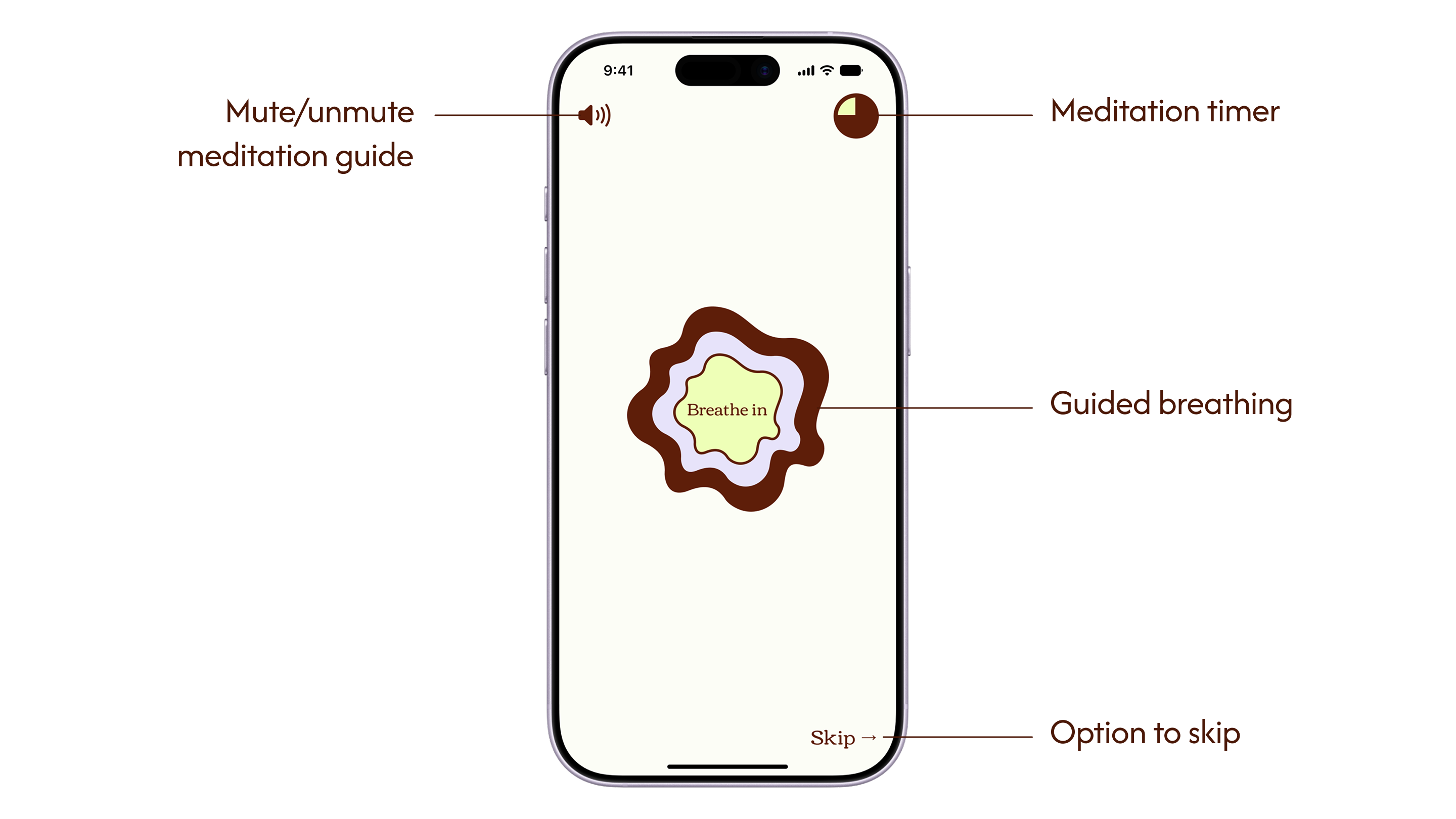
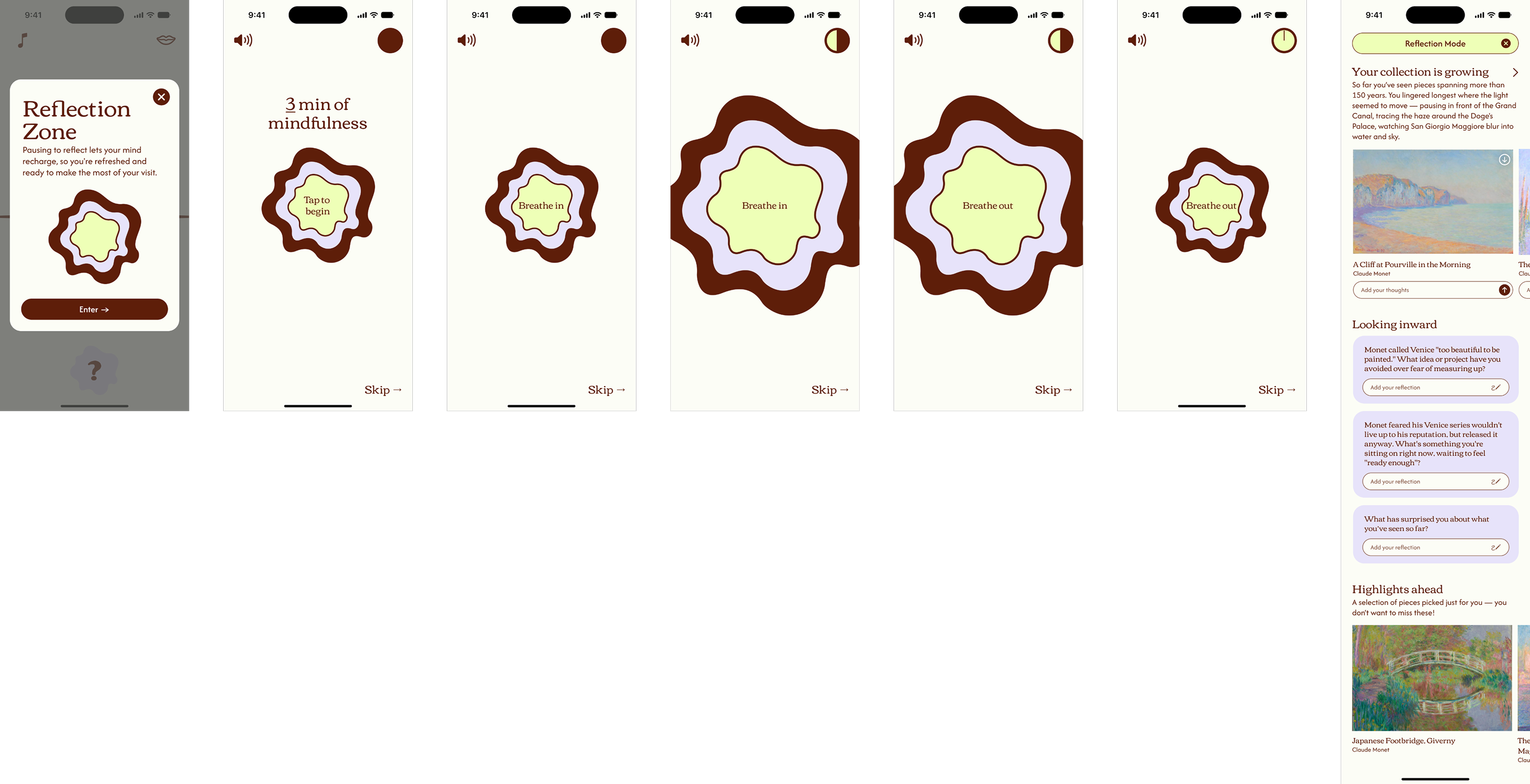
Guided meditation resets visitors' attention and encourages slowing down.
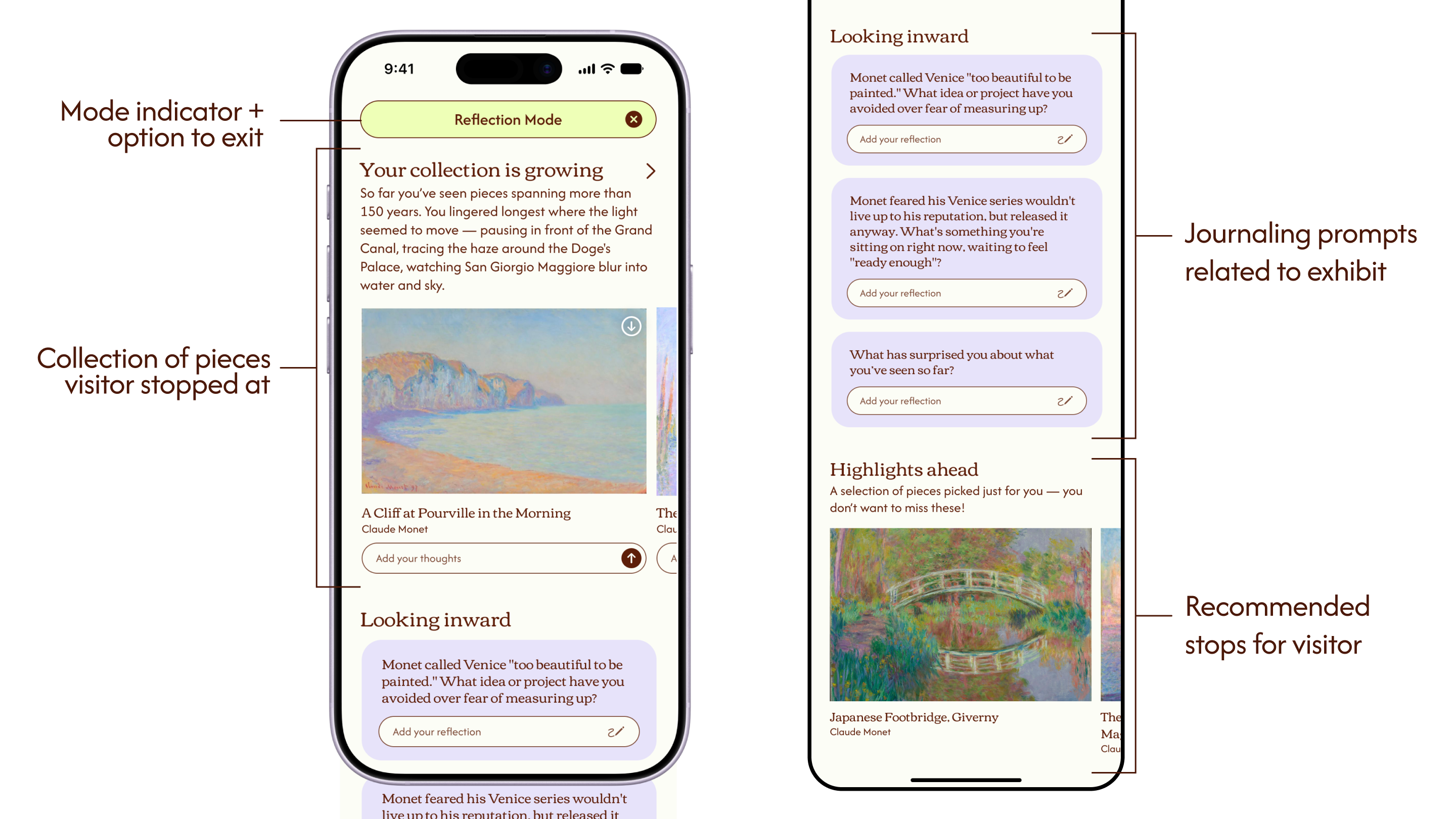
Their collection comes as a delightful reveal, themed prompts spark meaning-making, and a few highlights keep the second half meaningful (even on less energy).
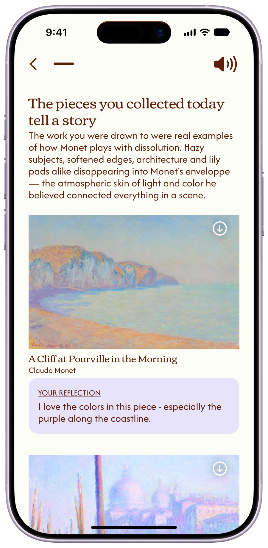
After visitors complete the guided meditation, Musea reveals their personal collection of pieces they've stopped at or engaged with along the way. This reveal is designed to be a moment of delight, and to give visitors time to consider their experience so far and process what they've seen. It's also one of the few points in the exhibit where being on a phone doesn’t detract from visitor attention on the art. Visitors have already stepped away from the exhibit content, so there's no risk of missing a piece while looking down at a screen. Here, visitors can also download hi-res images of pieces they enjoyed or add a personal comment.

Below that, to encourage the personal reflection/meaning making, is a selection of reflection prompts tied to the exhibit’s themes. These remain private to the individual and are not shared.

Last comes a shortlist of highlights, offered as options visitors can draw from if they want. The reflection space helps restore some energy, but it won't bring visitors back to full capacity, and by this point most are looking to wrap up. Surfacing a handful of highlights ahead of time reduces the effort of deciding where to go next, so a visitor can still walk away with something meaningful from the second half—even on a shorter, lighter pass. However, the choice of whether to follow these recommendations is still the visitor's own.
Part 3: After exhibit summary
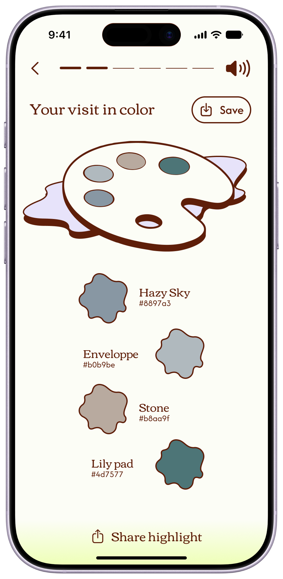
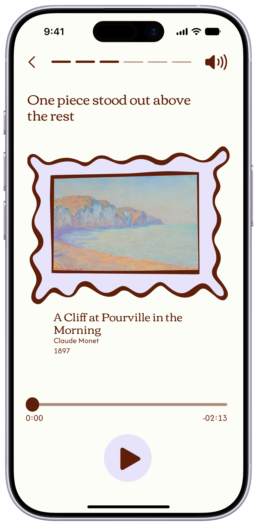
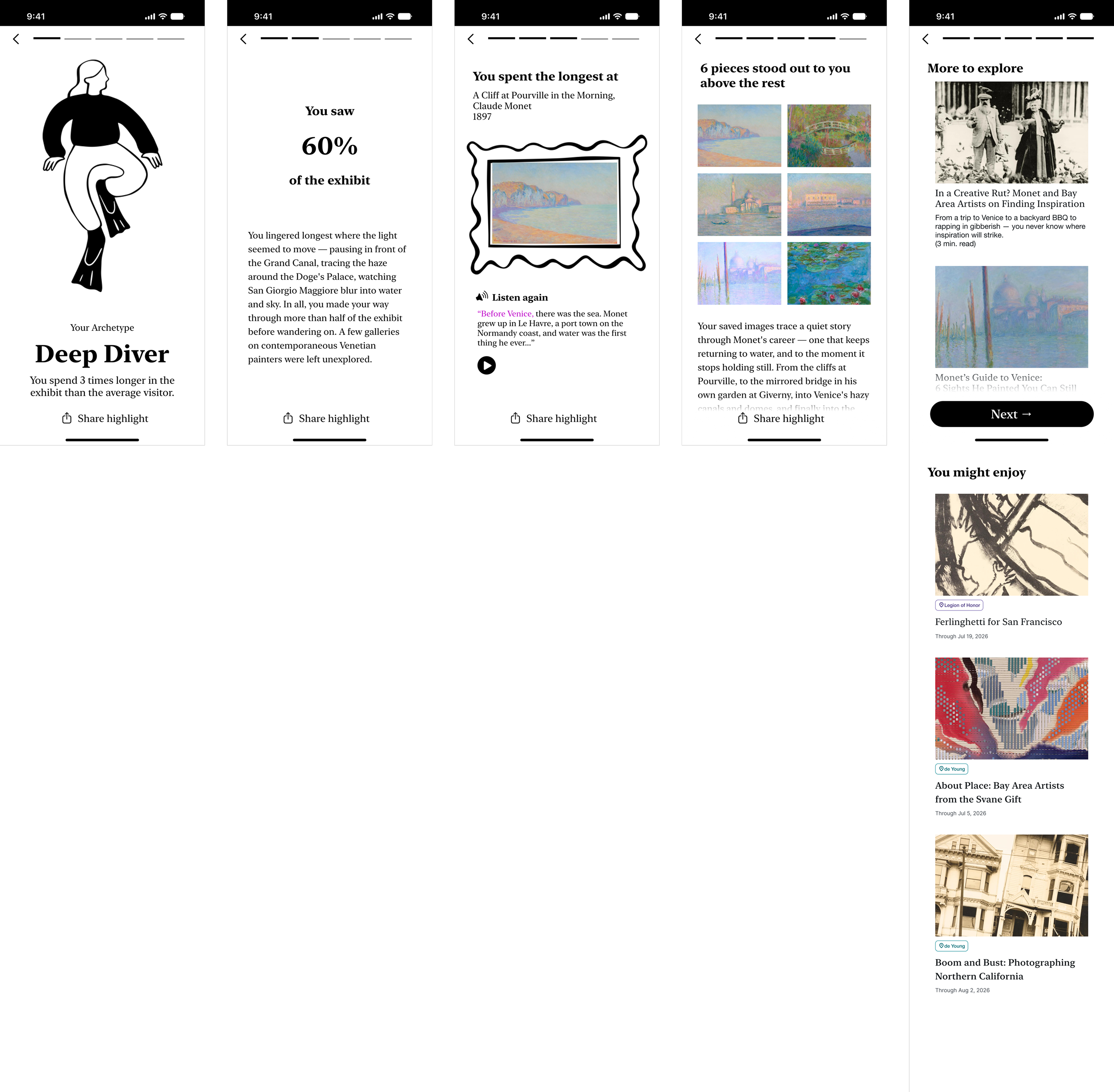
The third and final piece is an after-visit summary. Its goal is to close the experience out with a stronger sense of completion, add a moment of delight, and give visitors a reason to keep engaging with what they learned after they've left.
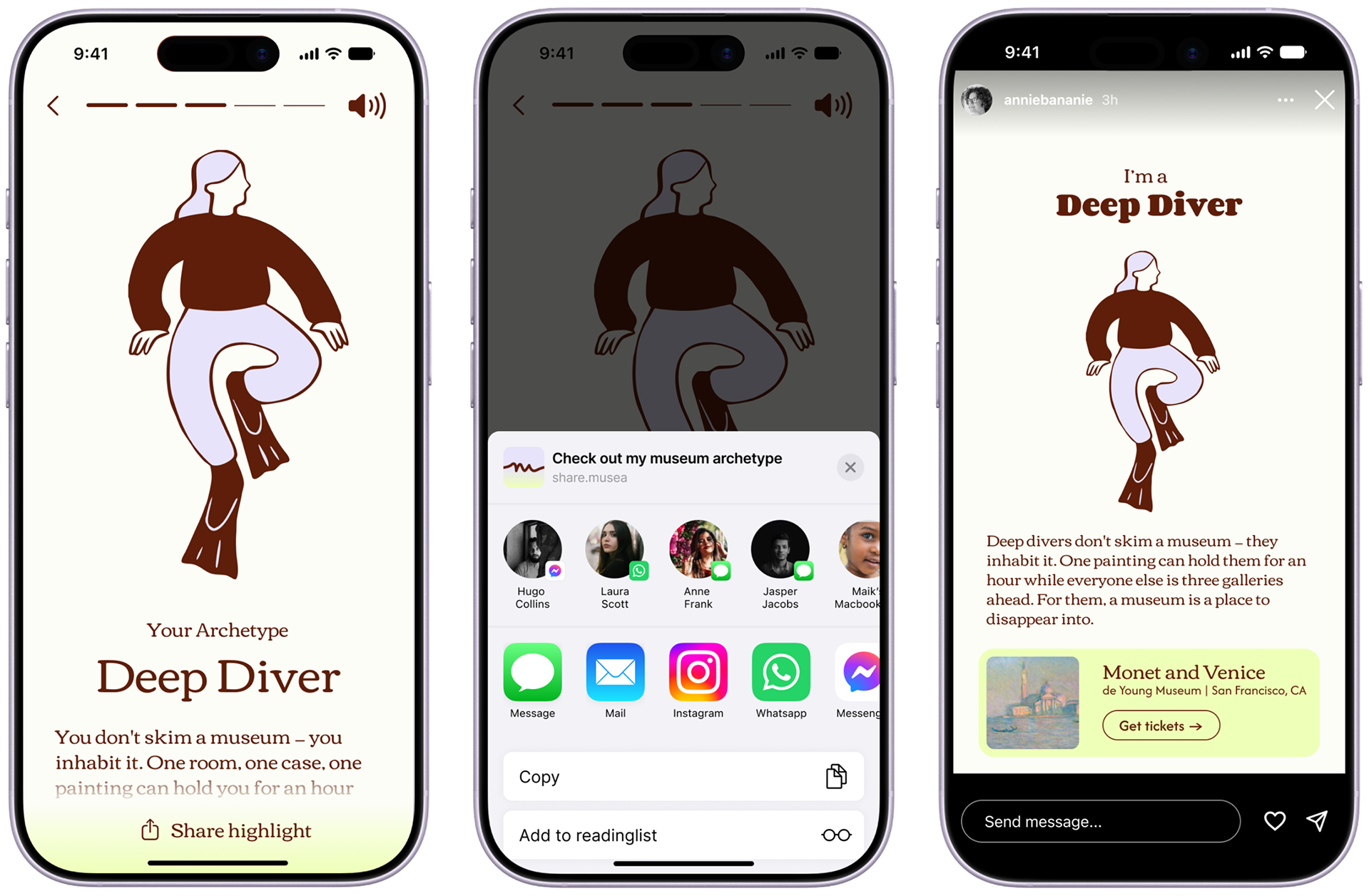
Certain summary elements are built to be shared — extending visibility for both the museum and Musea.
Process
Inspiration
The inspiration for this project came from a recent trip to Florence. While I was there, I visited the Uffizi Galleries—a popular stop for tourists in the city. The galleries were packed, but I noticed that people who weren’t visiting with a tour group largely looked lost and confused—wandering aimlessly, maybe stopping to take a photo of a piece they liked. Standing among the exceptional collection of art, I also felt adrift and unsatisfied and began to wonder how the experience could be improved.
Images: Wikimedia Commons, Arek N. and Armin Kleiner
Understanding context
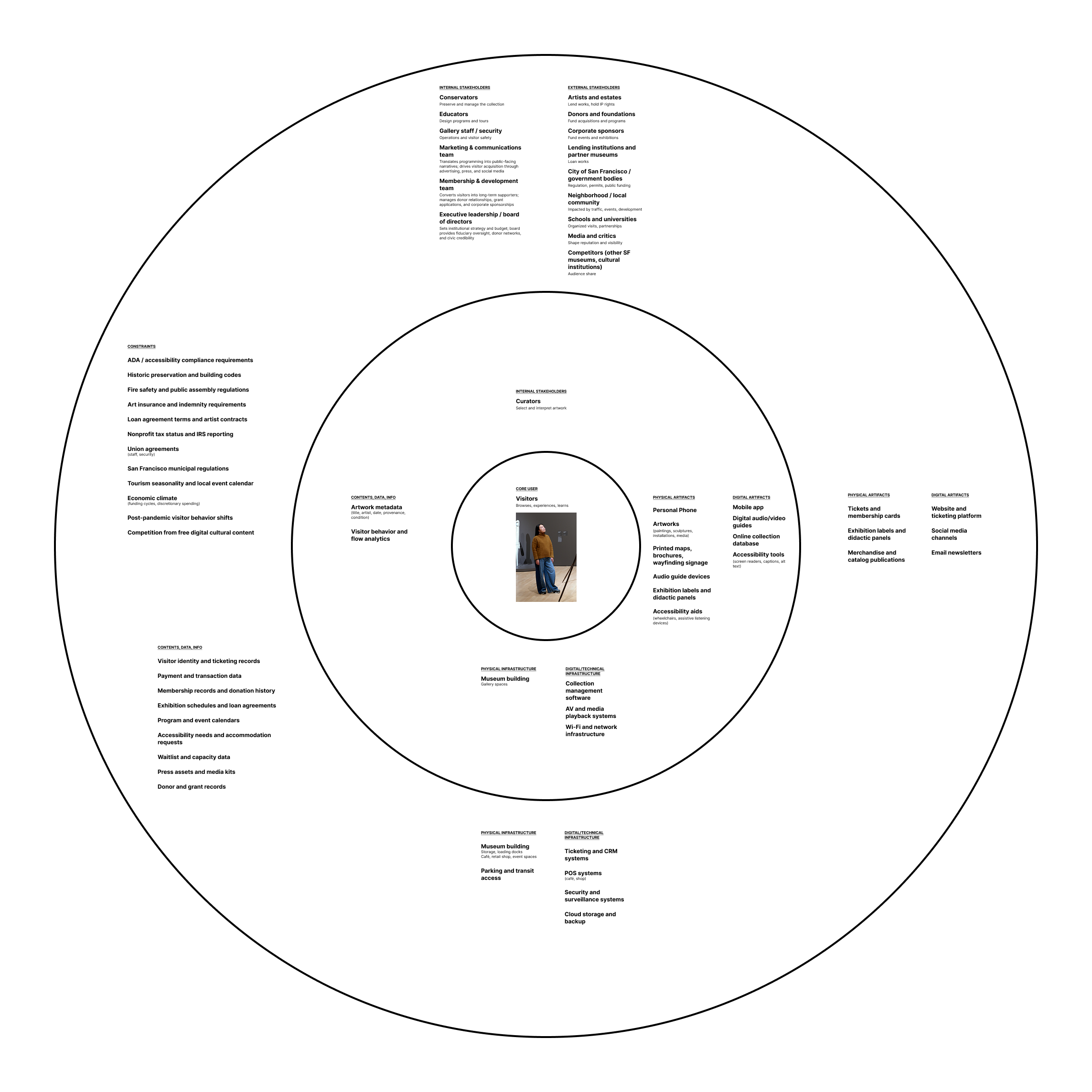
Once I decided to embark on this project, I knew I needed a better understanding of the broader context of the museum experience. I created an ecosystem map. One key piece I took away from this exercise was the role of the museum curators in shaping visitor’s experience. That was a throughline that I kept central to the experience moving forward.
Primary research
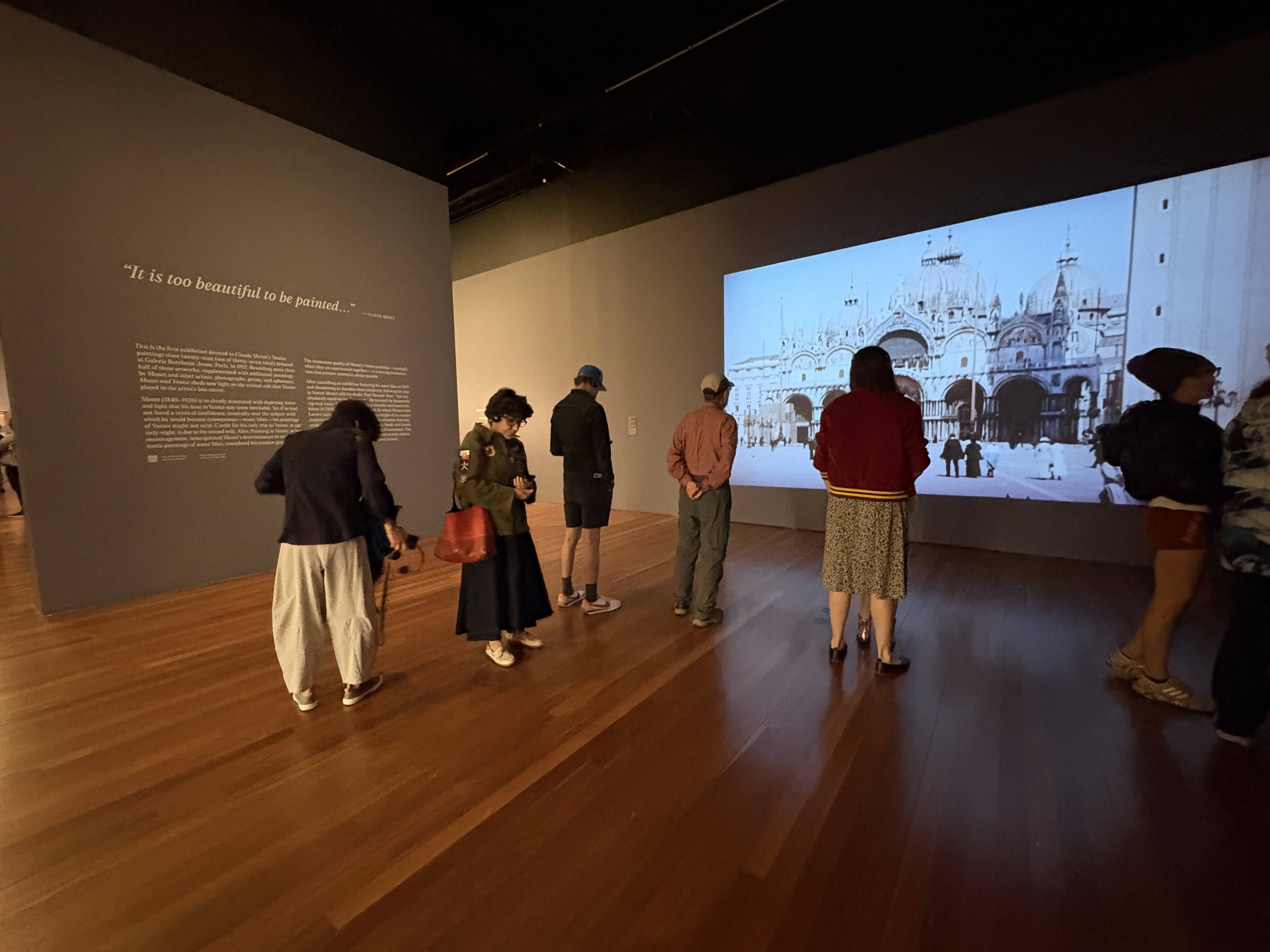
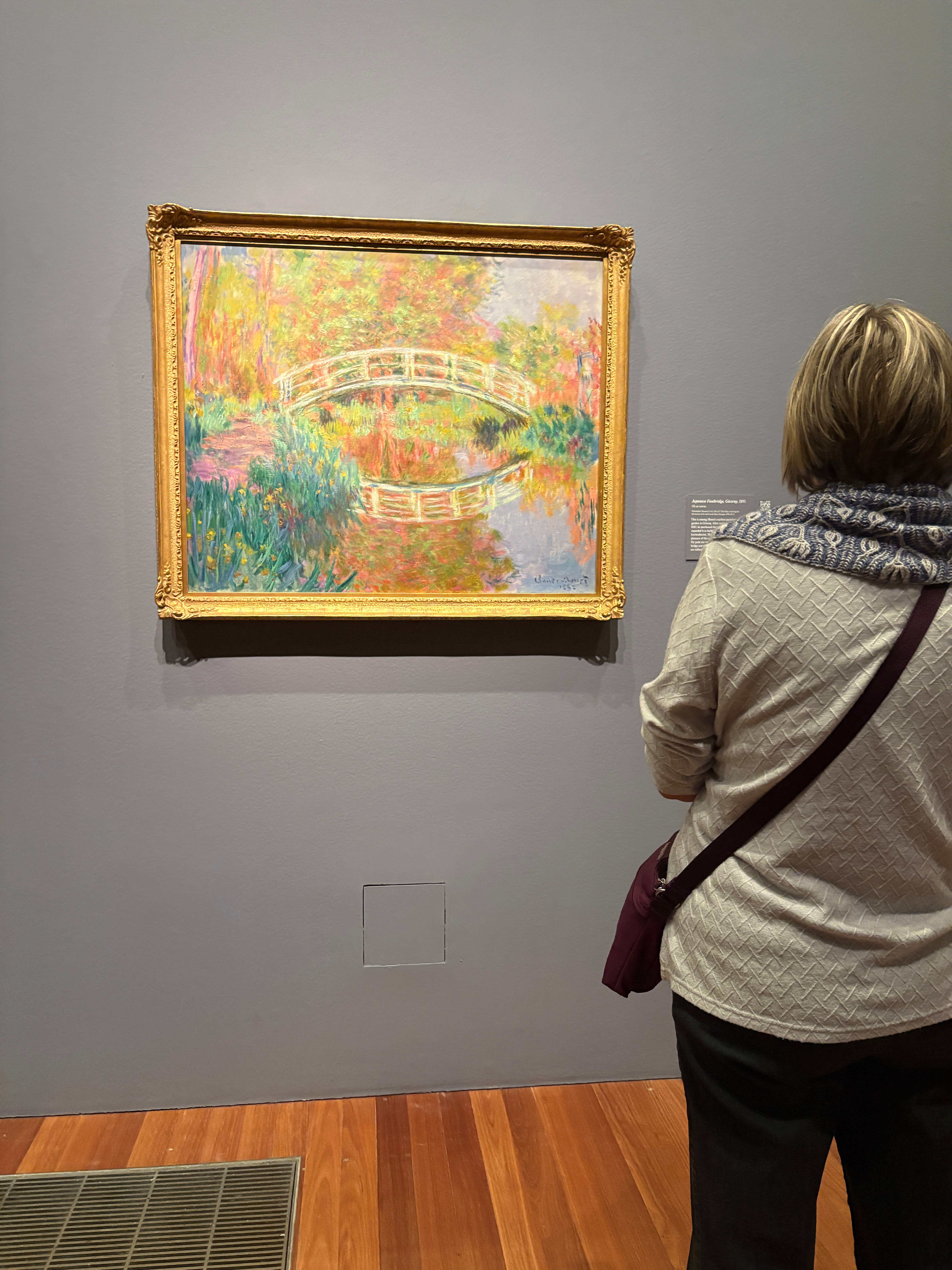
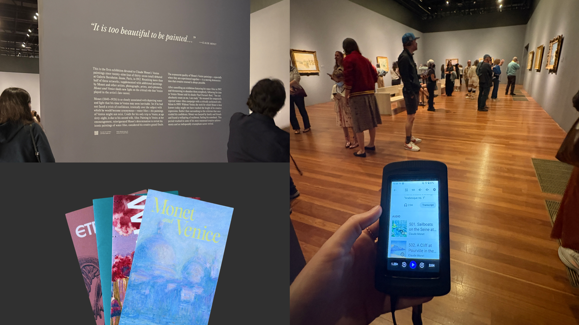
While my concept for Musea was for it to be a platform that could be adopted by multiple museums, I felt that it was important to start by designing within the context of a specific museum and exhibit. I chose the Monet and Venice exhibit at the de Young Museum in San Francisco. I visited the museum and observed the different touchpoints and visitors’ behavior in the exhibit.

Key observations from my visit:
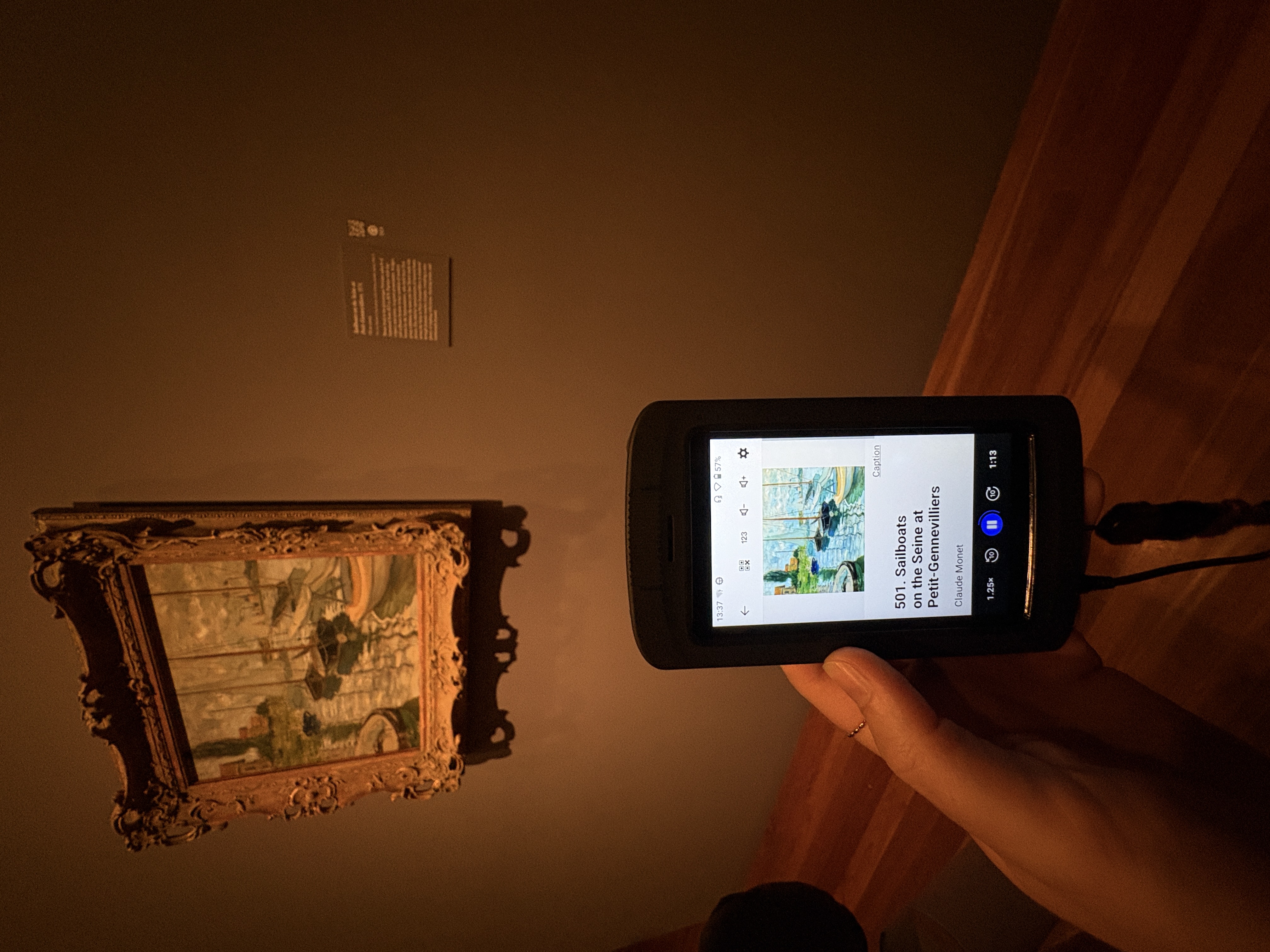
  • The majority of visitors appear to be using the audio guide.
  • Not every piece in the exhibit has an audio segment. I felt this created a disjointed experience and that scrolling to look for the right piece on the guide was distracting.
  • As I observed at the Uffizi, it appears many visitors default to taking photos of the pieces they like, but additional engagement is limited.
Secondary research
Then I also conducted secondary research into museum experience (best practices, challenges), how AI was being applied within the space, and what other ways people had tried to innovate in this area.

Museum Experience:
  • Visitor studies: Tracking-and-timing studies find visitors spend under 30 seconds at most exhibit elements and see only 20–40% of an exhibition.1
  • Museum fatigue: Museum fatigue is primarily cognitive, not physical, with a variety of causes including satiation, object competition, information overload, limited attention capacity, and ongoing cost/benefit decisions.2, 3
  • Heads-down problem: Designers of in-gallery device-based experiences need to be cognizent not to create experiences that cause visitors to spend more time looking down at their phones rather than at the art itself.4, 5
  • Photo-taking impairment: Taking pictures in a gallery has been shown to impair memory under certain conditions. Some attribute it to cognitive offloading—where the camera replaces the need for memory making—while others argue the cause is attentional disengagement—where taking a photo causes the viewer to distance themselves from the experience at hand. However, the studies behind this finding often used directed photography, where participants were told exactly what to shoot. In more natural conditions, volitional photography (where the visitor decides what to photograph) and detail-focused photos have been shown to increase engagement rather than impair it. This underscores the importance of preserving visitor agency and active engagement in a museum experience to ensure visitors stay mentally present and make memories that will last.6, 7, 8, 9

Precedents:
  • Adaptive Virtual Reality Museum: A Closed-Loop Framework for Engagement-Aware Cultural Heritage10
    Gaze, head motion, and walking speed feed a classifier that has an LLM adjust text complexity in real time. A 16-person pilot saw 2–3× more reading engagement versus static content.
  • SimViews: An Interactive Multi-Agent System Simulating Visitor-to-Visitor Conversational Patterns to Present Diverse Perspectives of Artifacts in Virtual Museums11
    LLM-powered visitor agents with distinct professional identities (ethicist, biologist) present diverse narratives, structured on Goffman's participation framework.
  • Artistic Chatbot: Case Study of a Voice-to-Voice RAG-Powered Chat System12
    Voice-to-voice RAG curator answers spoken questions via ceiling mic. Over a month-long deployment, 60% of responses stayed grounded in exhibition content; premature cutoffs from silence-based turn detection were the main flaw.
  • Experiencing Art Museum with a Generative Artificial Intelligence Chatbot13
    Photographing a painting triggers a chat (text/audio/both) with location-aware guidance. Performed on par with traditional tour apps for finding information, but visitors paid closer attention to artwork details.
  • Multidimensional Analysis of Visitor Interaction With Museum Apps: Designing for Enhanced Museum Experiences14
    Frames app engagement as app-focused, physical (AR/location audio), and meta (social/metaverse). Bookmarking-style personalization let visitors focus on the physical work instead of note-taking; recommends routes adapted to visit length.
  • Museum Exhibition Co-creation in the Age of Data: Emerging Design Strategy for Enhanced Visitor Engagement15
    Proposes "unaware co-creation": visitor interactions become data feeding a cyclical curatorial process, with technology kept as "subordinate support" to the narrative.
  • Advanced Visitor Profiling for Personalized Museum Experiences Using Telemetry-Driven Smart Badges16
    Bluetooth Low Energy badges pair OAuth pre-visit profiles with real-time dwell/proximity data (1.5-second location updates) for adaptive content and group formation. Badge users rated satisfaction 4.6/5 vs. 4.0/5 for non-badge users.
  • Cooper Hewitt, The Pen17
    Physical precedent: an interactive stylus letting visitors "collect" objects and design at in-gallery tables.

Bibliography
1. Serrell, B. (2006). Judging Exhibitions: A Framework for Assessing Excellence. Left Coast Press.
2. Bitgood, S. (2009). Museum fatigue: A critical review. Visitor Studies.
3. Bitgood, S. (2013). Attention and Value: Keys to Understanding Museum Visitors. Left Coast Press.
4. Walter, T. (1996). From museum to morgue? Electronic guides in Roman Bath. Tourism Management, 17(4), 241–245.
5. Ward, A. F., Duke, K., Gneezy, A., & Bos, M. W. (2017). Brain drain: The mere presence of one's own smartphone reduces available cognitive capacity. Journal of the Association for Consumer Research, 2(2).
6. Henkel, L. A. (2014). Point-and-shoot memories: The influence of taking photos on memory for a museum tour. Psychological Science.
7. Soares, J. S., & Storm, B. C. (2018). Forget in a flash: A further investigation of the photo-taking-impairment effect. Journal of Applied Research in Memory and Cognition, 7, 154–160.
8. Barasch, A., Diehl, K., Silverman, J., & Zauberman, G. (2017). Photographic memory: The effects of photo-taking on memory for auditory and visual information. Psychological Science, 28(8), 1056–1066.
9. Fawns, T. (2023). Cued recall: Using photo-elicitation to examine the distributed processes of remembering with photographs. Memory Studies, 16(2), 264–279.
10. Damouni, J., Tanus, W., & Unkelos-Shpigel, N. (2026). Adaptive virtual reality museum: A closed-loop framework for engagement-aware cultural heritage. arXiv:2603.13639. https://doi.org/10.48550/arXiv.2603.13639
11. Su, M., Liu, C., Zhang, J., Shuang, W., & Fan, M. (2025). SimViews: An interactive multi-agent system simulating visitor-to-visitor conversational patterns to present diverse perspectives of artifacts in virtual museums. In Proceedings of the 33rd ACM International Conference on Multimedia (MM '25).
12. Kucia, F. J., Grabek, B., Trochimiak, S. D., & Wróblewska, A. (2025). How to make museums more interactive? Case study of Artistic Chatbot. In Proceedings of the 34th ACM International Conference on Information and Knowledge Management (CIKM '25).
13. Wang, H., & Matviienko, A. (2025). Experiencing art museum with a generative artificial intelligence chatbot. In Proceedings of the 2025 ACM International Conference on Interactive Media Experiences (IMX '25).
14. Kim, J., & Kim, S. Y. (2025). Multidimensional analysis of visitor interaction with museum apps: Designing for enhanced museum experiences. Curator: The Museum Journal, 68(4), 622–636.
15. Derda, I. (2024). Museum exhibition co-creation in the age of data: Emerging design strategy for enhanced visitor engagement. Convergence, 30(5), 1596–1609.
16. Ivanov, R. (2024). Advanced visitor profiling for personalized museum experiences using telemetry-driven smart badges. Electronics, 13(20), Article 3977.
17. Cooper Hewitt, Smithsonian Design Museum. (2014). The Pen. Designed by Local Projects, Diller Scofidio + Renfro, and Tellart. https://www.cooperhewitt.org/new-experience/designing-pen/
Research synthesis
Taking my observations and learnings from research together, I decided to focus my efforts on the during and after phase of the user journey. Specifically, on how I could create a more personalized in-gallery experience so that visitors can make the most of their time there, and how I could rethink the after exhibit experience to create a more satisfying sense of closure.
Casual Museum Visitor
  • Visits a museum 1-2 times per year 
  • Is interested in art, but doesn’t have formal education on the subject
  • Starts off enthusiastic and thorough, then get fatigued and disengages
Concept development
Solution criteria:
Before designing, I identified a few criteria the solution needed to meet:
  • Be flexible enough for any museum to adopt
  • Operate within a traditional museum environment, including on crowded days
  • Keep visitors' eyes and attention on the art
  • Let visitor curiosity drive discovery

Initial concept:
Generally, I landed on the concept of a personalized docent: a mobile app with an AI agent tied to the museum's database, to help ensure credibility, relevance, and accuracy. The app would give visitors an easier way into the layers of information in an exhibit, and create a more interactive, adaptive experience tailored to each person.

Layers of information:
To flesh the concept out, I mapped the different layers of information at play in an exhibit:
  • What role does this piece play in the exhibit? 

    Curatorial storytelling
  • How was this created?

    Medium, technique, creative process
  • Why was this created?

    Historical context, artist’s life, relationship to other works, authored meaning
  • What does it make me feel?

    Individual reflection

Inputs and outputs:
Next, I thought through possible system inputs and outputs. I'd used the museum-provided audio device at the de Young, but found it was really just a less sophisticated version of the touchscreen phone already in my pocket, so I decided to center the experience around the device most people already carry: their own.
Inputs:
  • Camera - scanning
  • Location - position in the exhibit
  • Text - chat with the agent
Outputs:
  • Audio - a more customized version of a traditional audio guide
  • Links to resources - curator talks, articles, related works
  • Text - possible, but not preferred
Selected primary output:
Since one of the core project goals is minimizing visitors’ time looking down at their phones, I opted for audio to be the primary output of the system. It's often assumed that audio output implies audio input, but I decided that wouldn't fit a traditional museum environment—it would be socially uncomfortable for many visitors to talk to their device in a quiet environment and disruptive to everyone else nearby.
Interaction triggers:
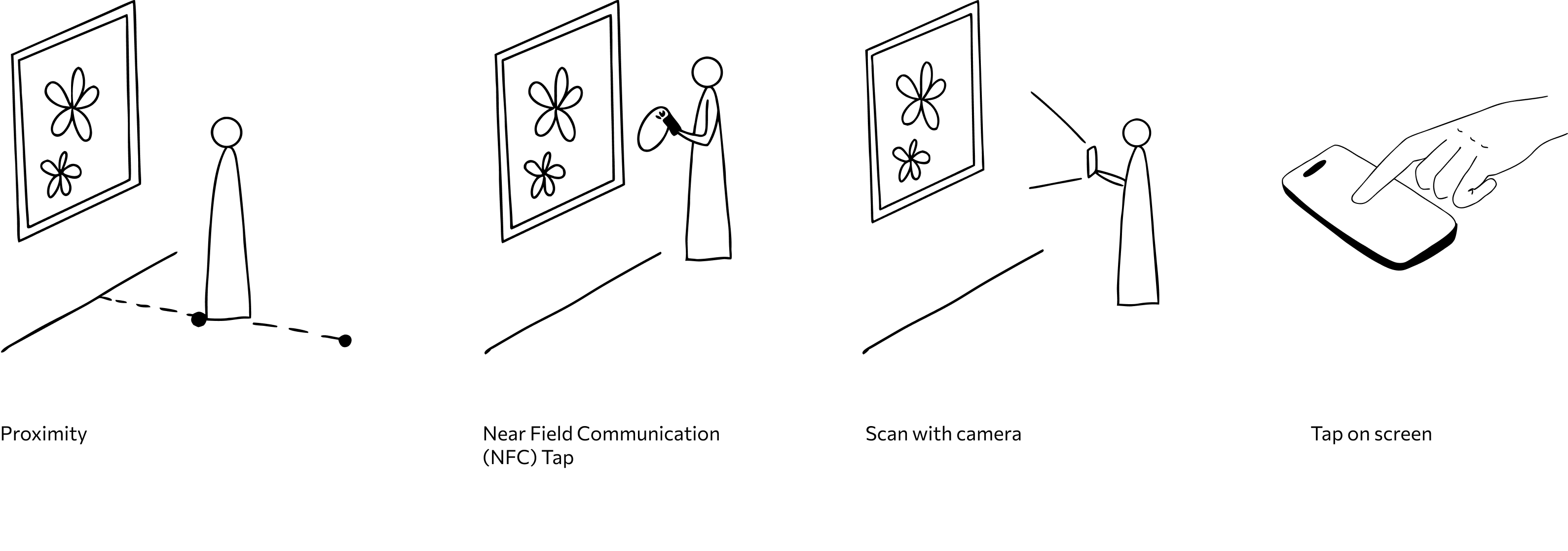
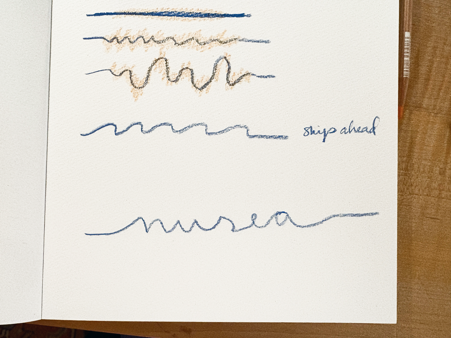
I wanted interaction triggers that were passive and ambient, rather than something that put visitors back on their screens. I explored a few options:
Concept sketches:
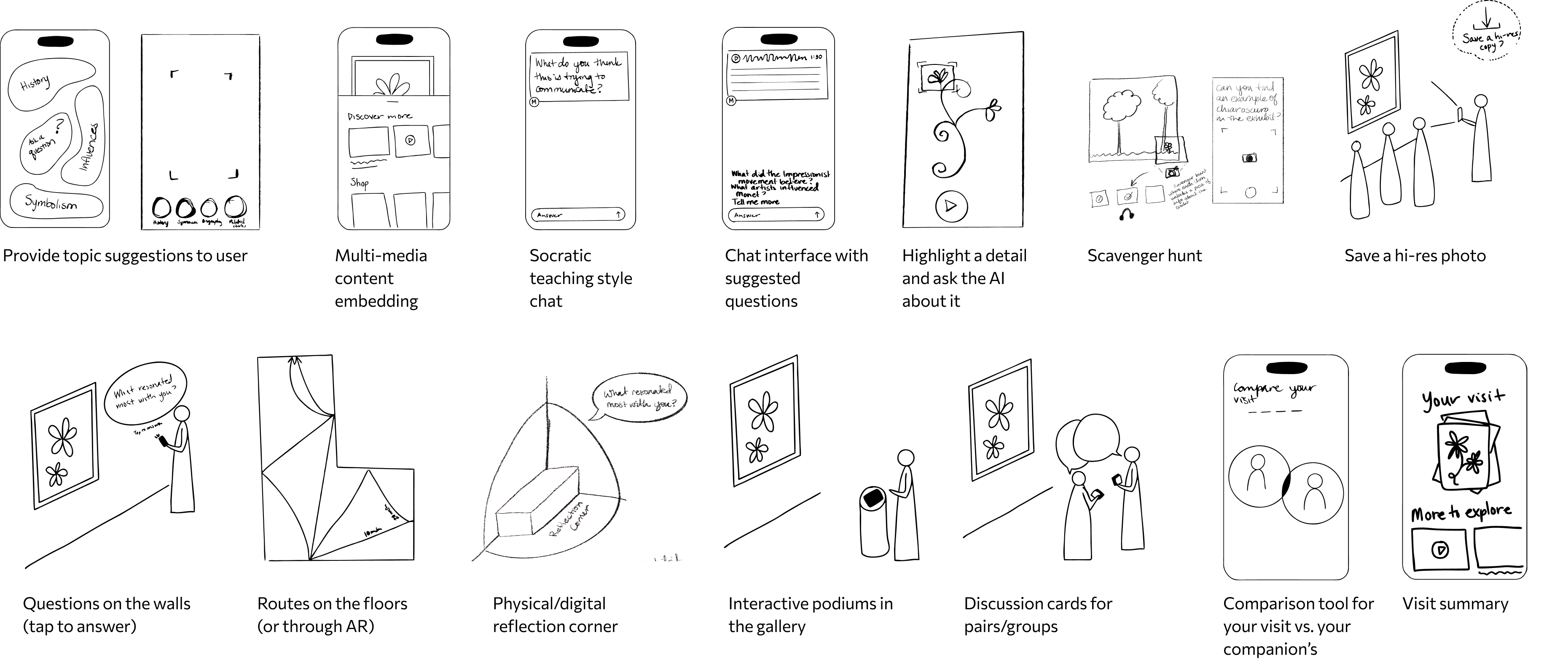
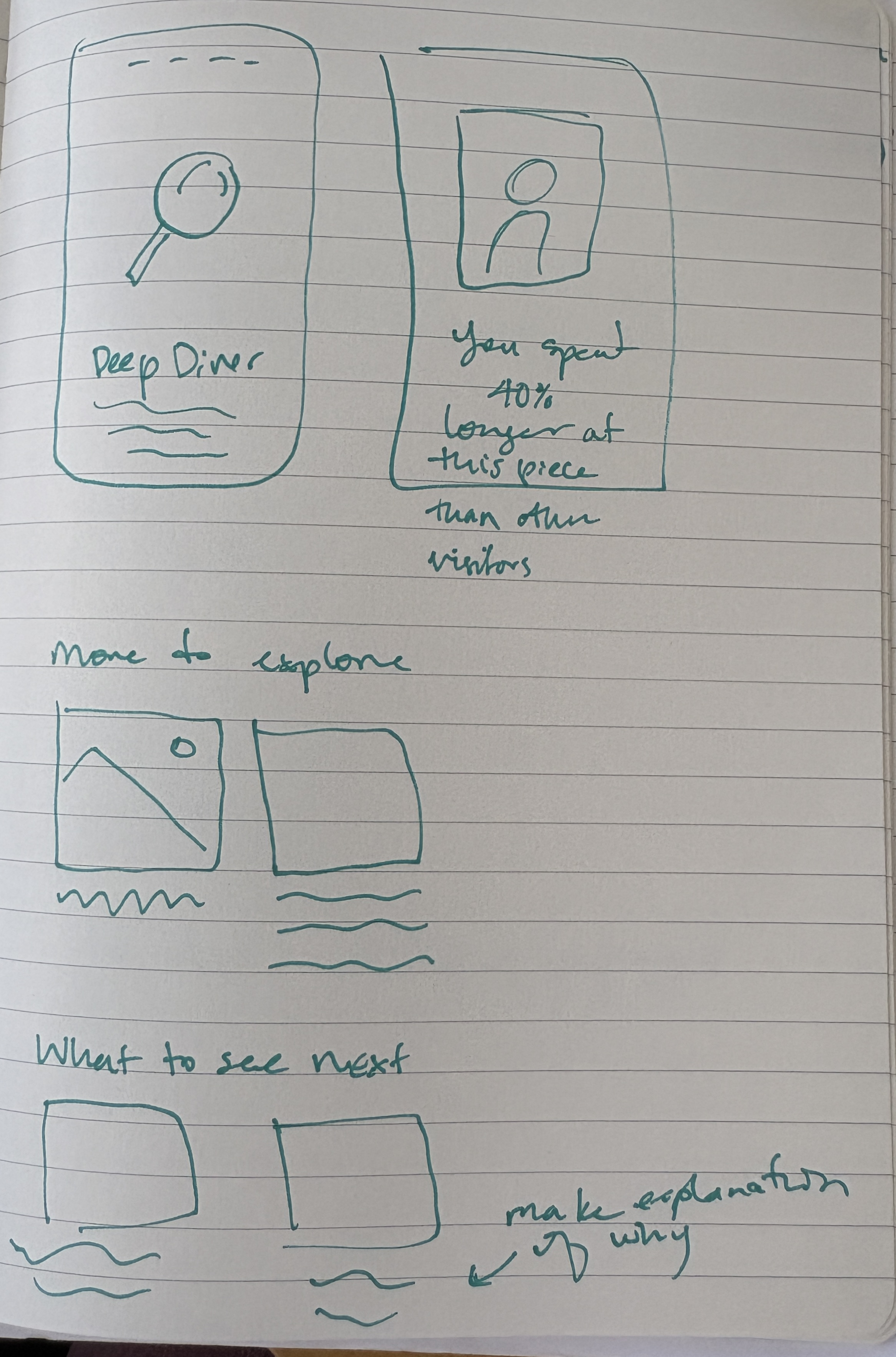
From there, I sketched out concepts for both the in-gallery and after-exhibit experiences:
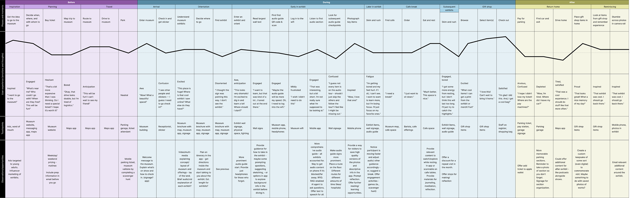
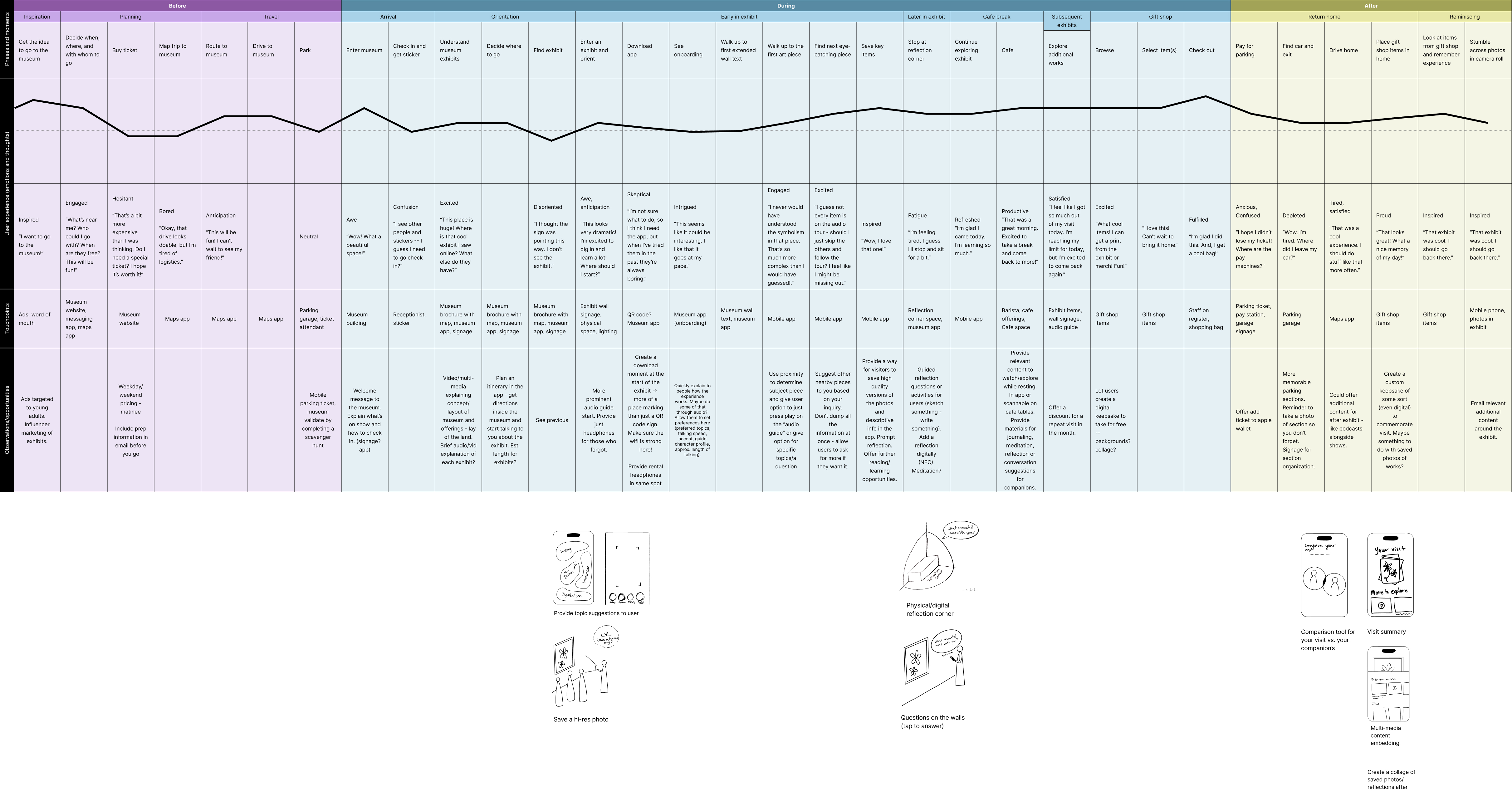
Updated journey map:
From there, I evaluated these concepts against my solution criteria, narrowing to the few that best balanced flexibility, heads-up interaction, and visitor-driven discovery—then updated the journey map to reflect the redesigned system.
Prototyping
Interface development:
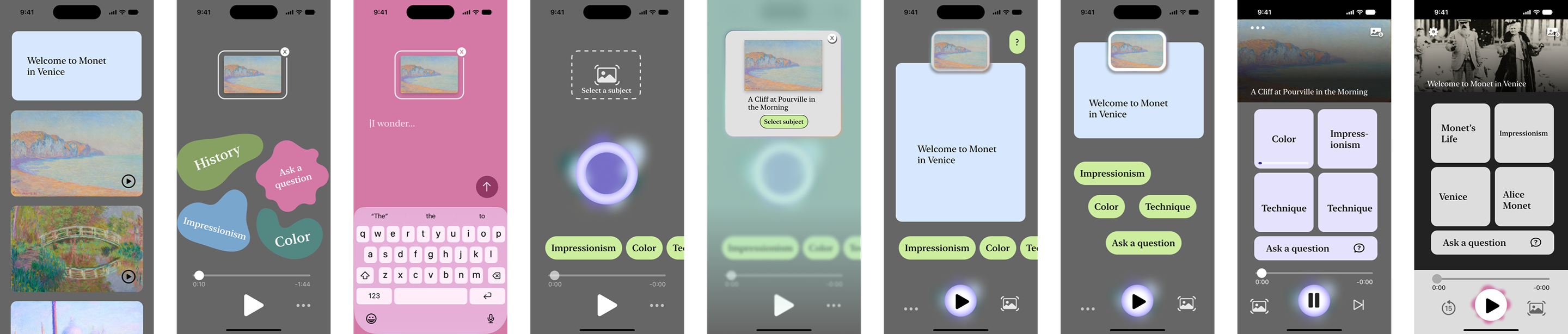
From there, I moved into low-fi prototyping, cycling quickly through many iterations before landing on one direction to test.
Content generation:
At the same time, I explored whether AI could realistically shape the exhibit content. To test this, I pulled content from the Monet and Venice exhibit and ran it through Claude to generate a script, then used ElevenLabs to produce synthetic voice. I varied which piece I specified as first, second, or third to see how visit order changed the generated content  and set a target script length to test pacing. Comparing the result side-by-side with the exhibit's original audio guide script, I saw a real difference in storytelling and continuity, which gave me confidence the AI-driven approach could work.
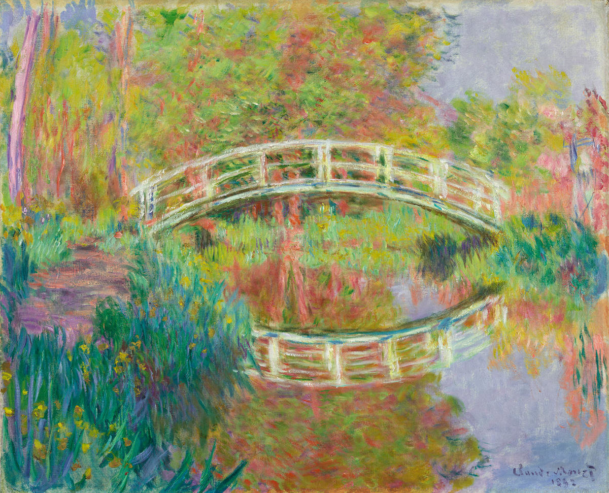
Japanese Footbridge, Giverny
Claude Monet
Original audioguide content:
‍‍
‍Monet character voice: The crucial thing is the mirror of water, whose appearance changes constantly with the reflections of the sky.Narrator: — wrote Monet. Reflections were another element of water that captivated the artist. In 1883, he moved his family to the village of Giverny, north of Paris. There, he kept a studio boat. He used it to paint on the river Seine, a few minutes’ walk away — you’ll see paintings of the river nearby.

At home, he created a flower garden that would provide him with inspiration for years to come. His most ambitious project was the water garden, with an arched bridge echoing those in the Japanese prints that he loved and collected. Monet painted the bridge over and over again.

Earlier in Monet’s career, he becomes famous for his repetition, or series pictures. So taking the same subject and reproducing it at different times of the day, even different years — trying to see how light and different weather conditions will change its appearance.

When Monet gets to Venice, he’ll do something quite different. He’ll return to the same subject matter at the same time of day, or as close to it as he can approximate, so that he is painting not a series, but rather a selection of “motifs,” as he will call them.
Generated sequence-based content:

In Venice, Monet painted the same views again and again, always at roughly the same time of day — trying to catch one exact, fleeting moment of light. But that habit of returning to a subject over and over started years earlier, at home.

In 1883, Monet settled his family in Giverny, north of Paris, where he built a water garden centered on an arched footbridge inspired by the Japanese prints he collected. He painted that bridge over and over, chasing how light and weather changed it from one hour, one season, to the next. "The crucial thing," he wrote, "is the mirror of water, whose appearance changes constantly with the reflections of the sky."

That's the thread running through everything you've seen today — Pourville's hazy cliffs, Venice's trembling canals, and this footbridge, all studies of the same restless subject: light, water, and the moment just before it changes. It's fitting that this is where Monet's story leads back to. After Venice reignited him, he returned to Giverny and gave himself entirely to this garden — to the water lilies that would occupy him for the rest of his life.
Testing
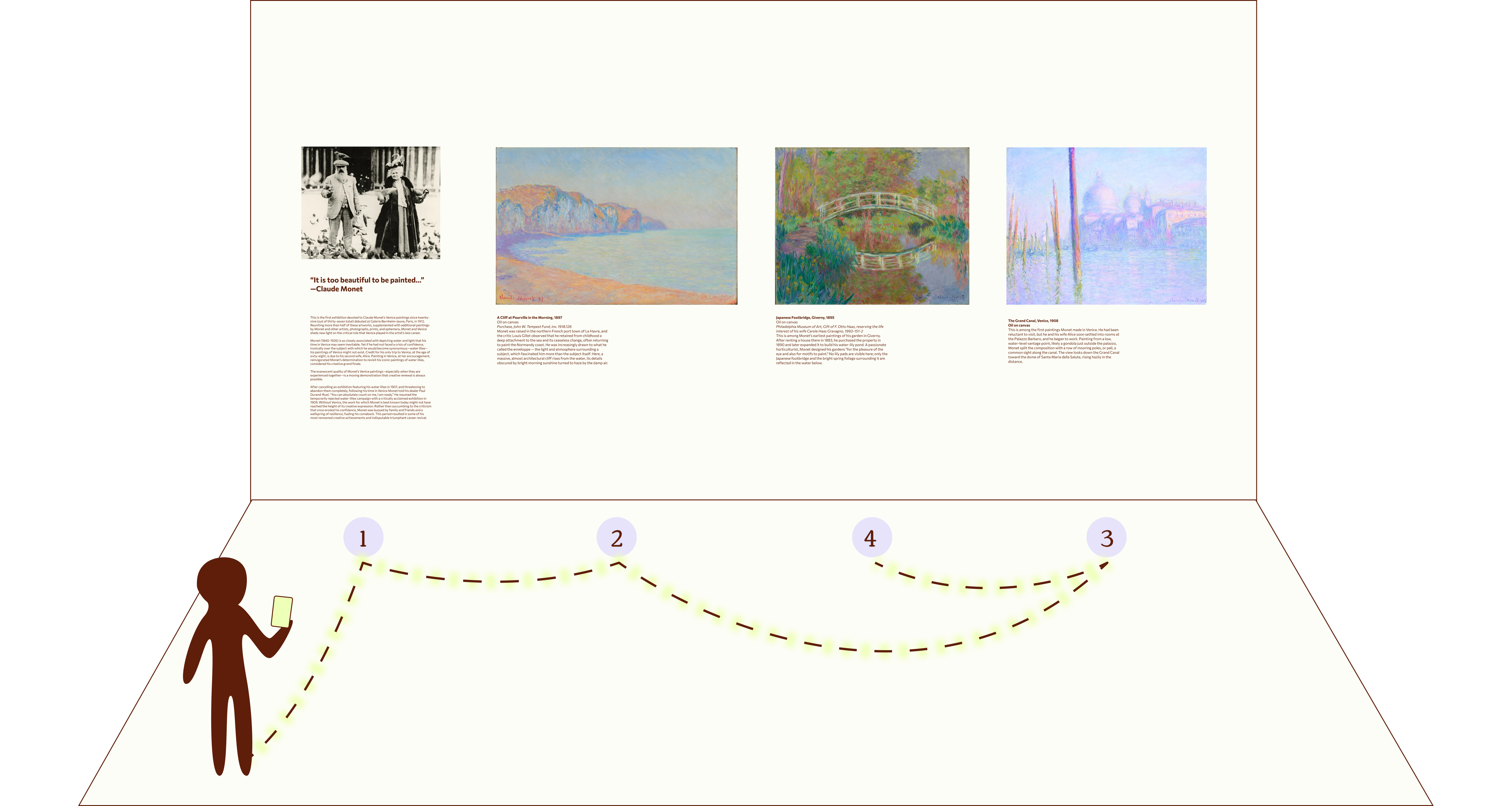
To test the central personal guide feature of Musea (specifically the proximity-based interaction mode and the adaptive content), I built a mini mock gallery of the welcome wall text and three paintings and captions from the Monet and Venice exhibit. I used Claude and Eleven Labs to generate the content, simulating how Musea's AI would actually assemble the audio segments, and ran it as a Wizard-of-Oz prototype to quickly approximate the interaction.
I tested with five participants total, but after the first two, a pattern emerged:
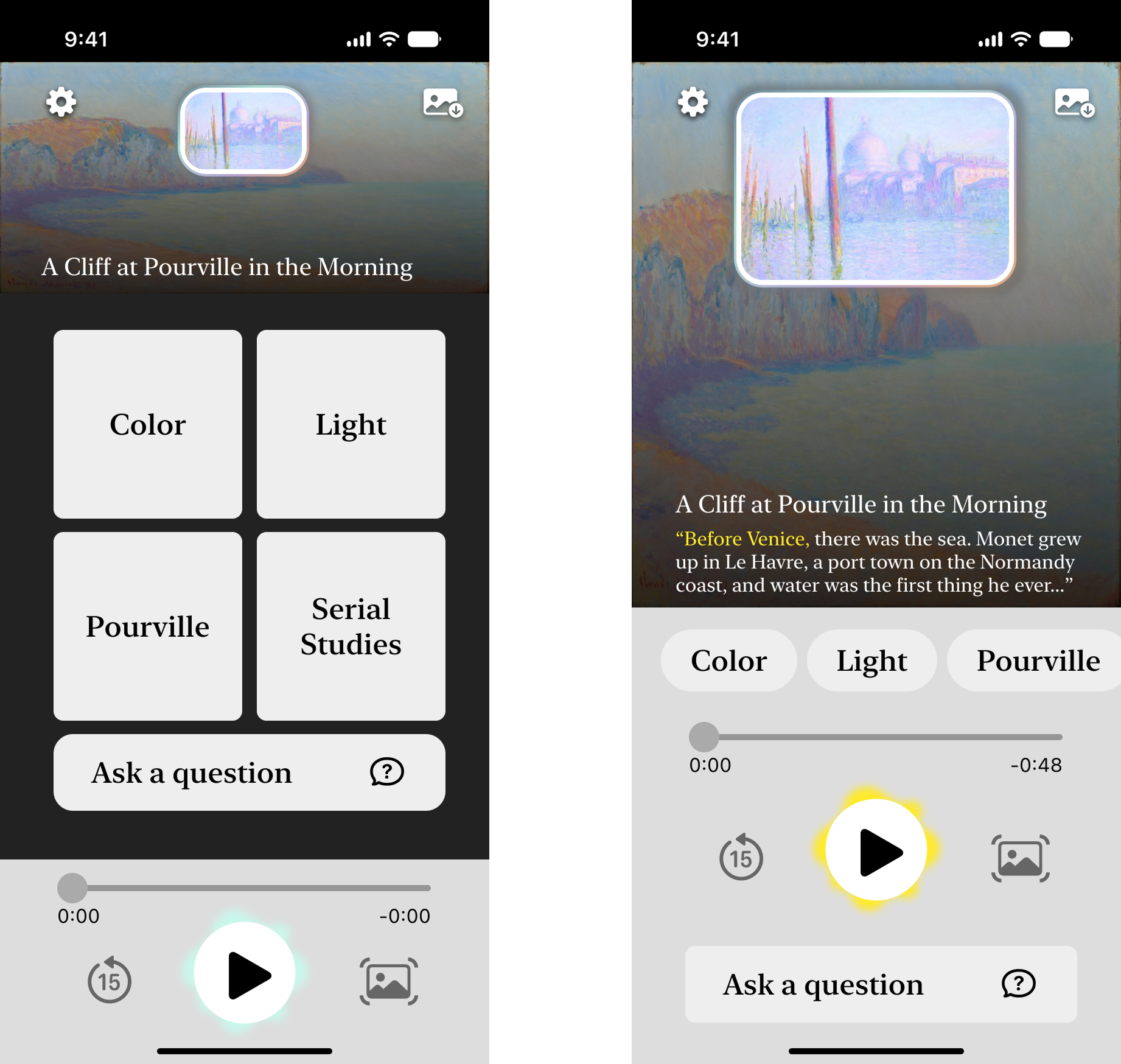
  • They were unsure where to click first and confused the large central buttons with the play button at the bottom
  • They also weren't connecting the painting in front of them with the image on screen
Based on this, I updated the design between sessions and tested again. Changes included:
  • Replacing the large topic buttons with filter pills
  • Enlarging the current artwork image
  • Adding a transcript preview
  • Enlarging the "up next" proximity preview
Even with these changes, testers still found the interface at odds with the concept. Their feedback indicated it looked too traditional for what was supposed to be a cutting-edge system, and they struggled to understand how it differed from a normal audio guide or what value they would get from it. The interface still felt cumbersome, and the number of options remained overwhelming.

Even so, most testers were still interested in the core concept and expressed real dissatisfaction with the traditional museum experience — a sign the idea had legs, even if the execution didn't yet.
Redesigning the core interaction
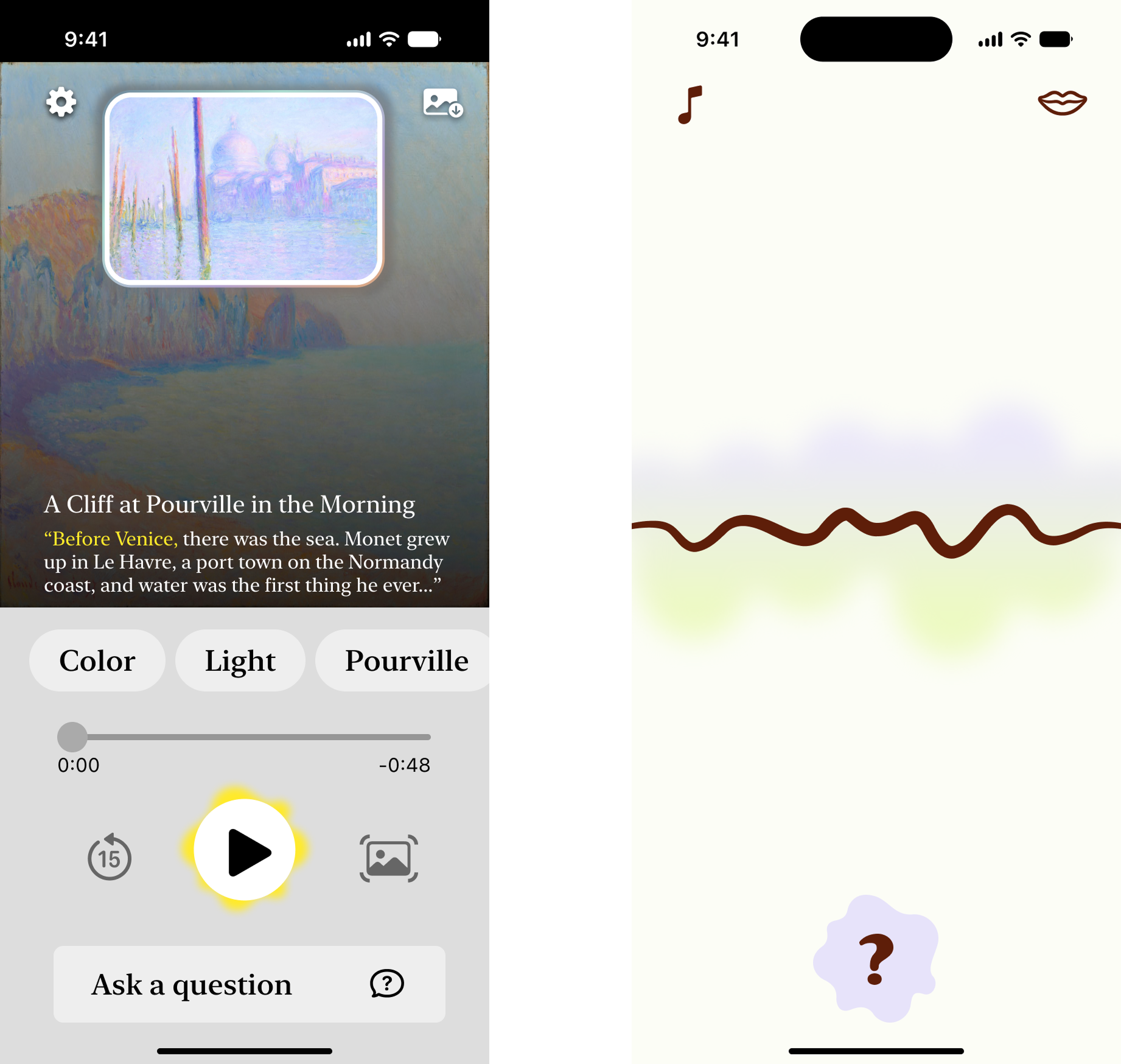
Based on these results, I decided the interface needed a full rethink. I started stripping it back to its simplest form and explored different ways to represent the audio agent itself, looking at how companies like Anthropic and Spotify had designed their own audio agent experiences for reference. Eventually I landed on an instrument-string metaphor for the central interaction, and moved into a high-fidelity prototype built around it.

Testing this version of the interaction yielded greatly improved results. People enjoyed the string pull interaction and immediately grasped the agentic audio experience.
Reflection zone and after exhibit summary
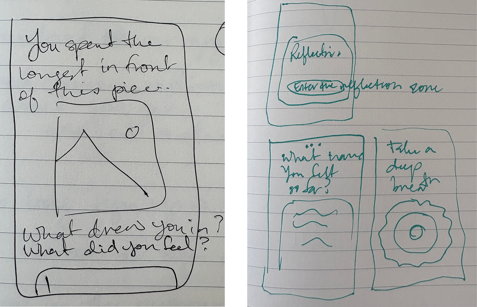
As I refined Musea’s core interaction, I also fleshed out the reflection zone and after-exhibit summary. I moved through sketching, wireframing, and light-weight testing to brainstorm and test the different versions of content to include in these areas.

Combating “museum fatigue”
The purpose behind the reflection zone was to combat the “museum fatigue” phenomenon that strikes visitors mid-exhibit. The primary driver of this has been shown to be cognitive fatigue from the stream of new information in an exhibit. Therefore, I decided to begin the reflection zone experience with a guided meditation to help visitors clear their minds.

After that, I experimented with a combination of journal prompts and insights. While the primary goal of the experience during the exhibit is to keep visitors’ eyes on the art, in the reflection zone, it is okay for users to engage more with their device. Therefore, I included a mini-reveal at this point—showing that the app is gathering the pieces the user has interacted with and building them a personal gallery.

To meet my project’s overall goal of helping novice users engage more meaningfully with art (through close observation, learning, and reflection)—the reflection zone allows users to make note of what they thought about the saved pieces. I also included a selection of journaling prompts related to the exhibit’s themes (which could be set by the exhibit curators). Encouraging users to slow down and relate what they’re seeing to their personal experiences helps them form more lasting memories and make what they’re learning stick. Instead of passively moving through content (and having it go in one ear and out the other), this makes visitors more active participants—giving them both agency to have an opinion (despite being novices) and getting them to think critically about what they’re seeing.

Knowing that ultimately a moment of rest can help restore visitor’s energy partially, but that most people will still be ready to wrap up their visit more quickly in the second half, I’ve included a selection of highlights from the exhibit ahead that would be picked for them by Musea based on their browsing behavior in the first half. The goal of this is to support users in still having a meaningful second half on less energy. However, it is still ultimately up to the user whether they follow these recommendations or not—they are intended to be suggestions, not a prescriptive path.
Closing with delight
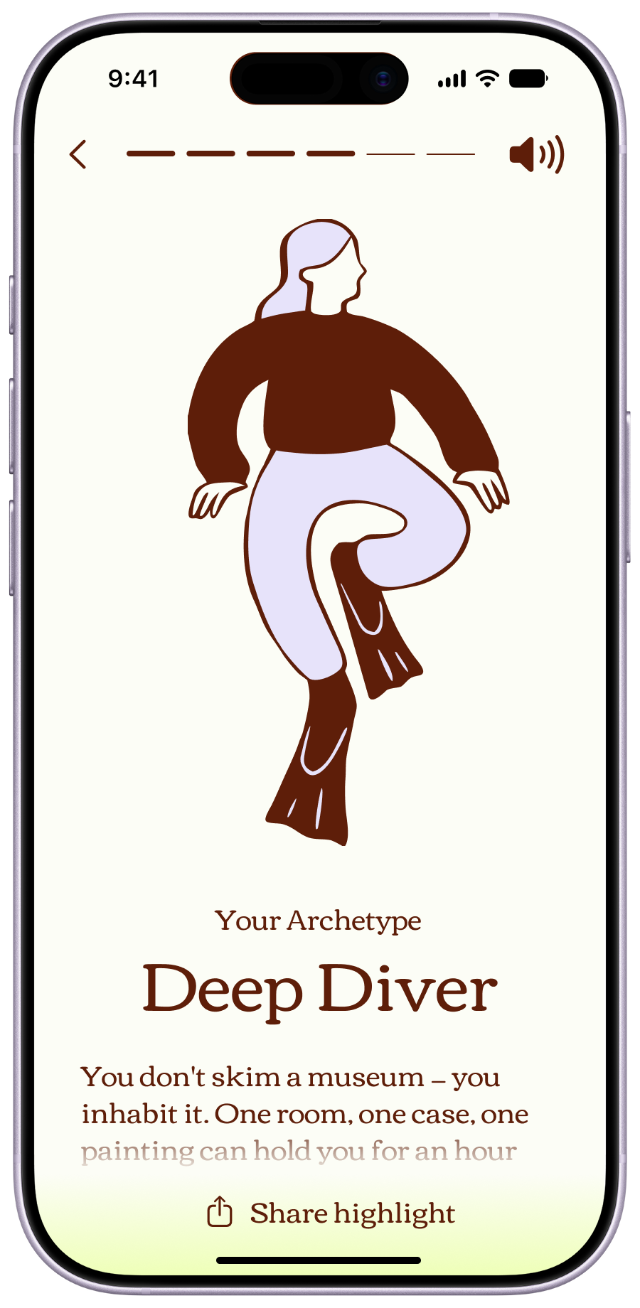
Today, the museum experience ends when the visitor leaves the building—one of the lower points in their journey when they are the most exhausted. The goal of the after exhibit summary is to turn this fizzled ending into a moment of delight that feeds curiosity and encourages future learning.

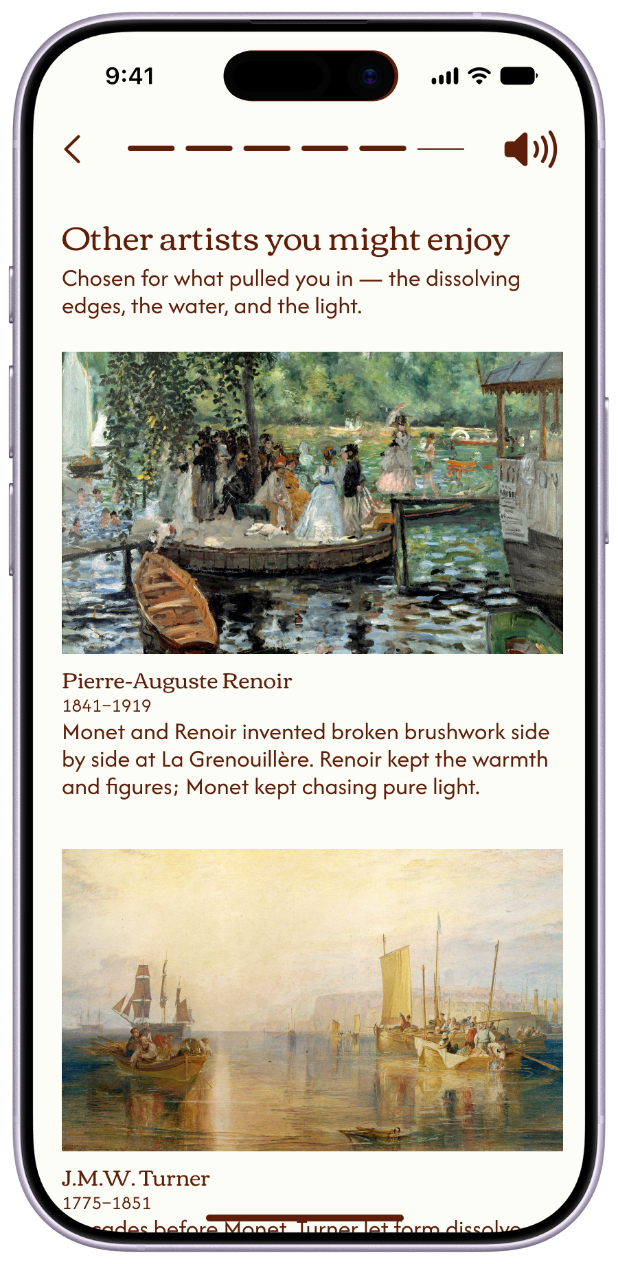
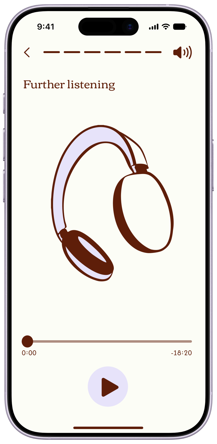
I included a mix of insights, deeper dives into content, and recommendations for continued exploration in the summary. I also included a few highlights specifically intended for sharing on social media so that visitors can show off their experience to their network and to create visibility for the exhibit and museum.

Feedback on the initial versions indicated the language was too literal and quantitatively-focused. So, in later versions, I leaned into a conversational tone and content that spoke to a visitor’s personal experiences.

After these updates, people were enthusiastic about the summary—especially the archetype, color palette,  and suggested artists pages.
What's next
For this initial version of Musea, I focused closely on the most critical features. With more time, there are a few ideas I'd like to explore further:

Companion mode:
Many people visit museums with friends or in groups. I'd like to explore how Musea could enhance that experience — perhaps through a shared audio experience, letting visitors compare their visits, or surfacing discussion questions based on what each person focused on.

Visitor profiles:
If Musea were adopted across multiple institutions, a visitor's profile could carry over and tune their experience across different visits. I'd like to understand what effect that has on the experience, and how visitors could access or refine that data themselves.

Pre-tuned content:
I would like to continue experimenting with offering different customization options for users’ audio experience—such as a mode for kids or one focused on a particular topic (i.e., history). This could take the form of varied system prompts for Musea to reference when compiling each content segment. One significant consideration with this is whether users know from the start of their journey what they would like to focus on. I still want to avoid adding a cumbersome set up step or forcing a choice users aren’t prepared to make.